rebrand {
communicate startup vision faster }
before
problem
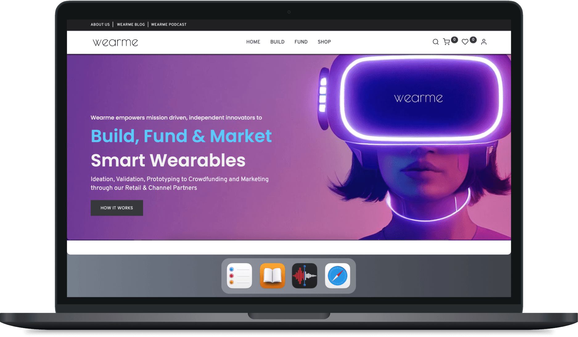
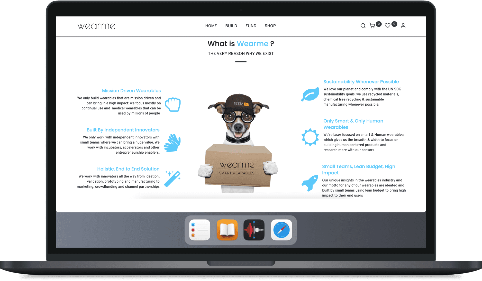
No one, customer or investor, quite understands what the startup is about because they are pursuing multiple things. The support team receives the same basic questions again and again.
after
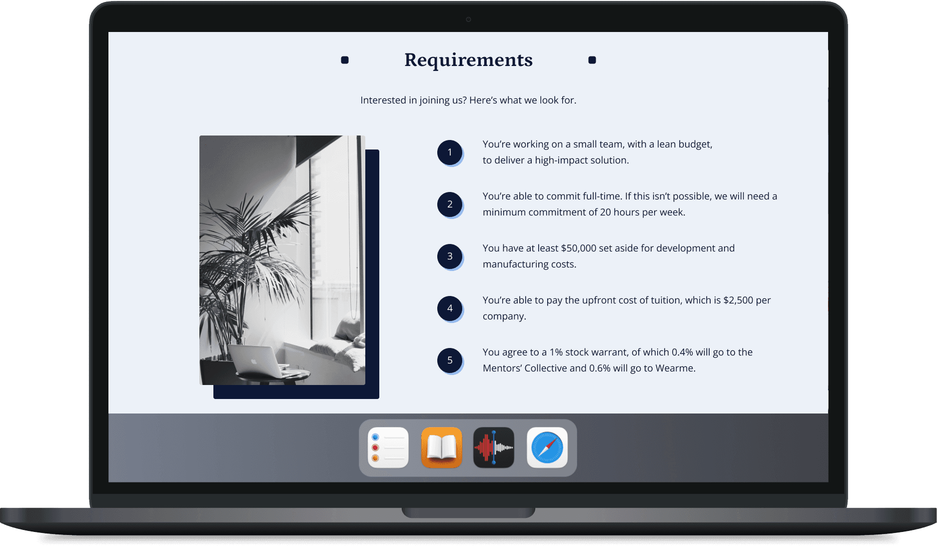
solution
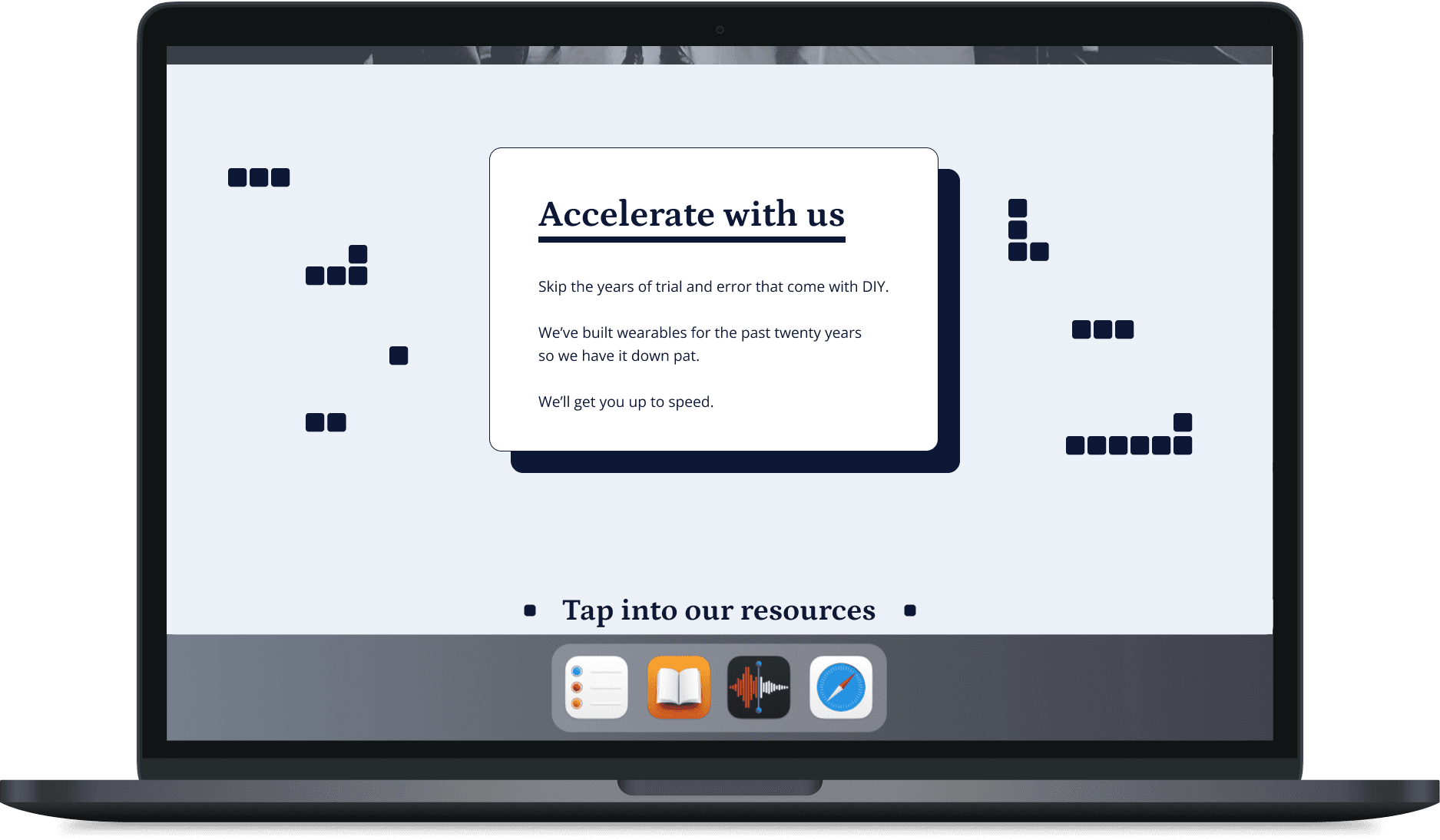
Within three weeks of joining, I learned about the company’s mission and business strategies, initiated a rebrand, planned the overall site architecture, and redesigned the introductory pages for one of the main business ventures: an accelerator program.
background
The founding team has several different products and businesses that are in the early stages. Their target audiences have not yet been defined, and their in-house products might change drastically with future iterations.
constraints
There was only one engineer who could implement designs, and that was the CEO. As the CEO of an early-stage startup, he didn’t have much time to implement all the design details.
my role
I was the only designer. I initiated a rebrand for the company, including a new color palette and typography scheme. I built wireframes for the site architecture and handed off high-fidelity designs.
stakeholders
I had daily syncs with the CEO to share design updates. When it was time for implementation, he made the final call on both copy and visual design.
📝
learn
To create a website that best represents the company, I needed to understand the CEO’s vision. What was he trying to achieve? What was his passion? Attending events helped me soak in the company’s values.
original login flow
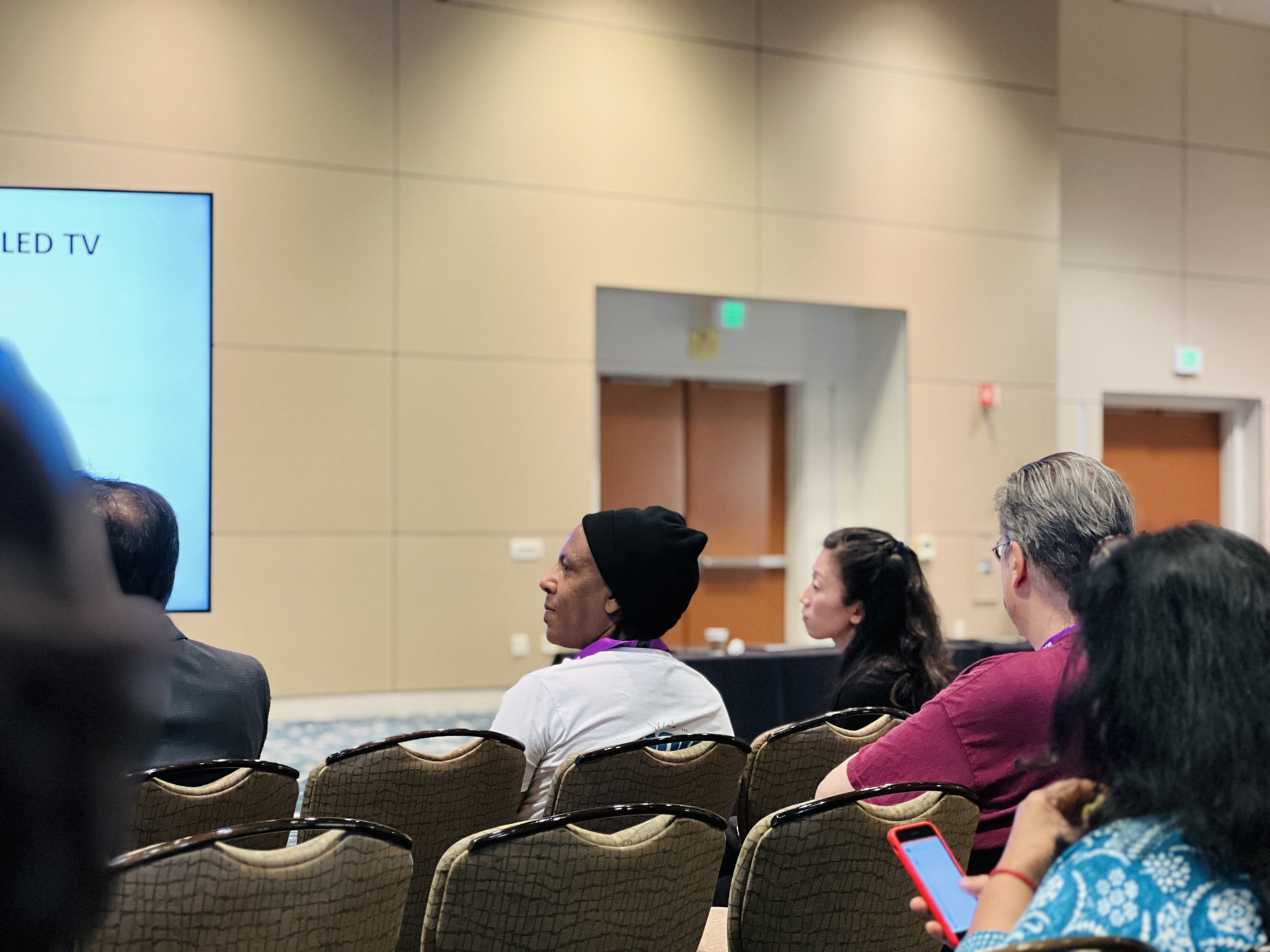
startup pitch contest
Wearme was invited to join a pitch contest at the IoT Tech Expo.
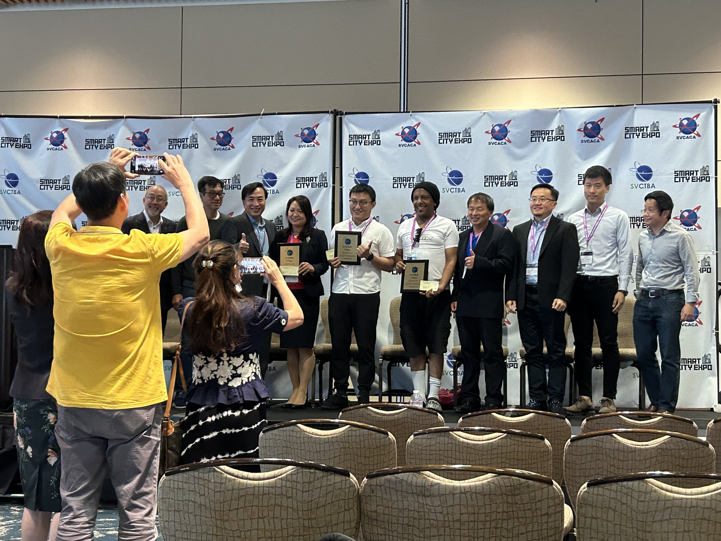
3rd place!
Everyone had 5 minutes to pitch, and Wearme placed third! We also got a nice check for $300.

wearables event (our own)
Wearme hosts a meetup every month to build a strong community.
plan architecture
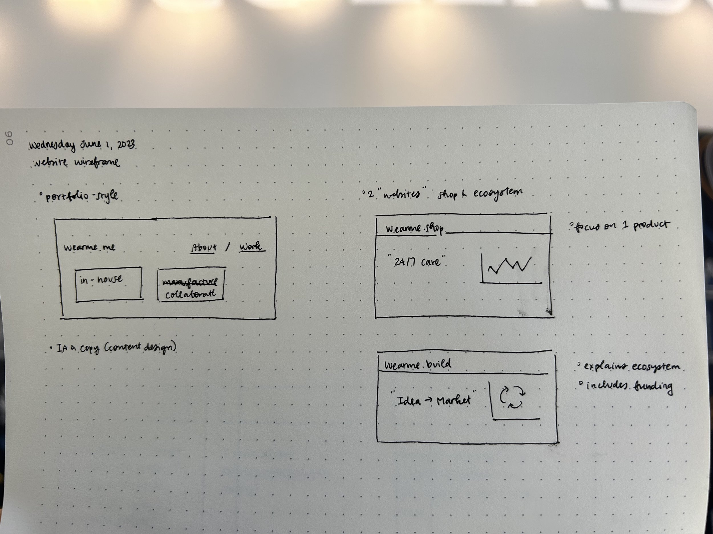
first wireframe sketch
My first idea was to take a portfolio approach so that visitors could see our different services in one glance. This was based off of an audit of a close competitor, which is an agency.
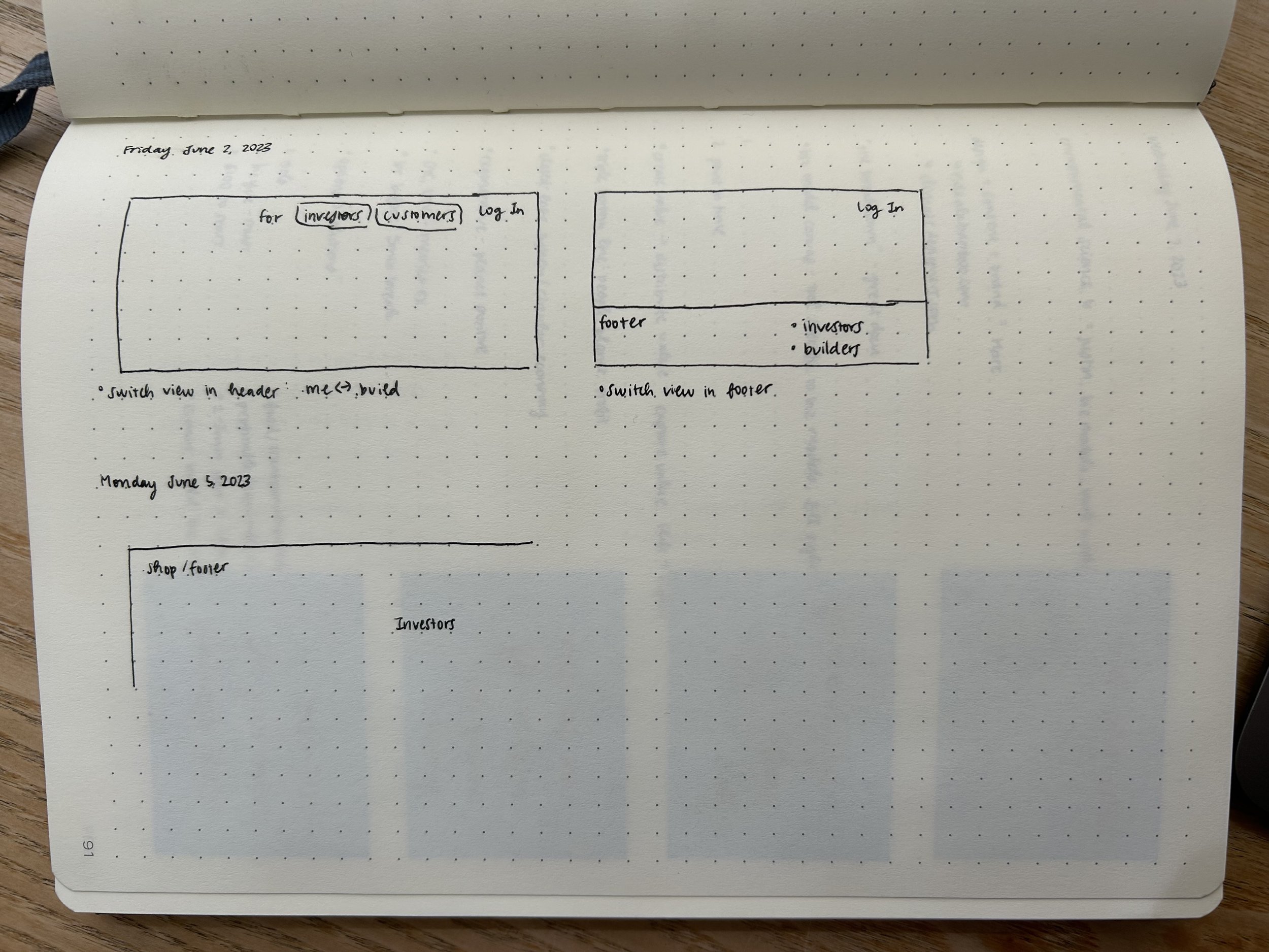
more information architecture
The CEO originally planned to have 4 “websites” to represent different aspects of the business.
How about 1 instead of 4? We could use the top navigation bar to tailor the experience.
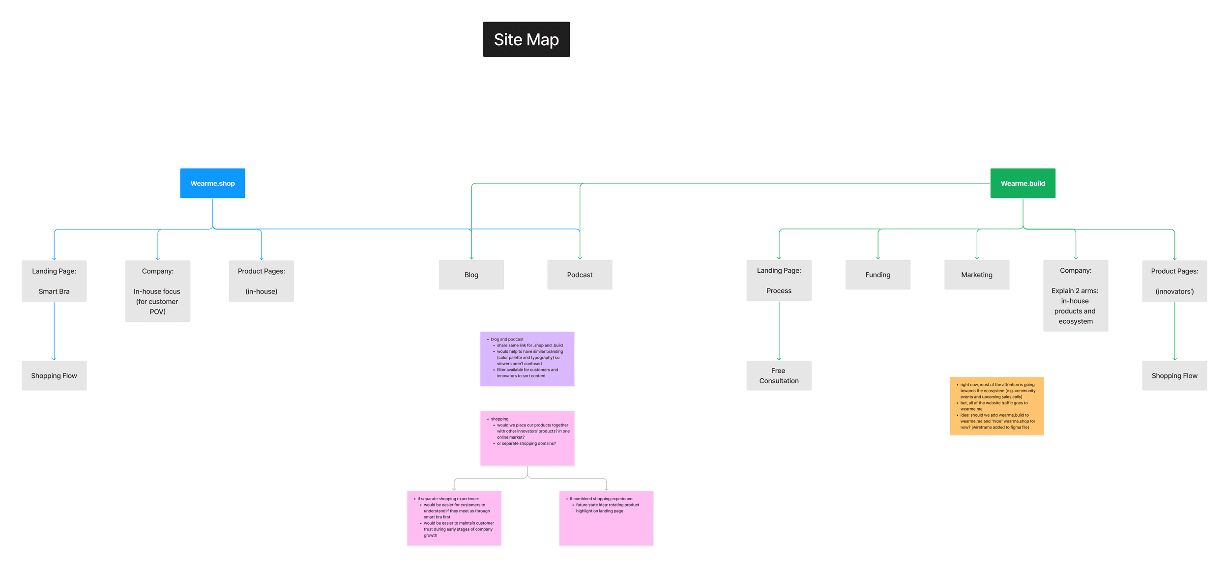
mapping out general web content
After discussing how to position ourselves, we eventually decided on two websites. In order to build the most intuitive site architecture (and minimize future development work), I needed to confirm how these websites would be used and where they might overlap.
plan: rebrand
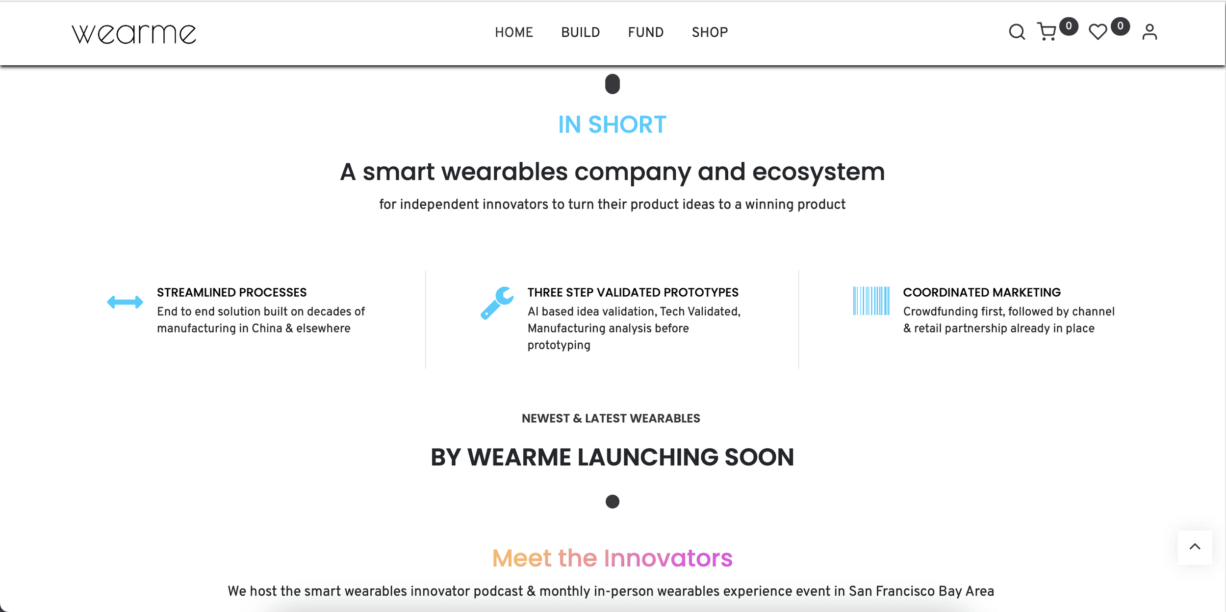
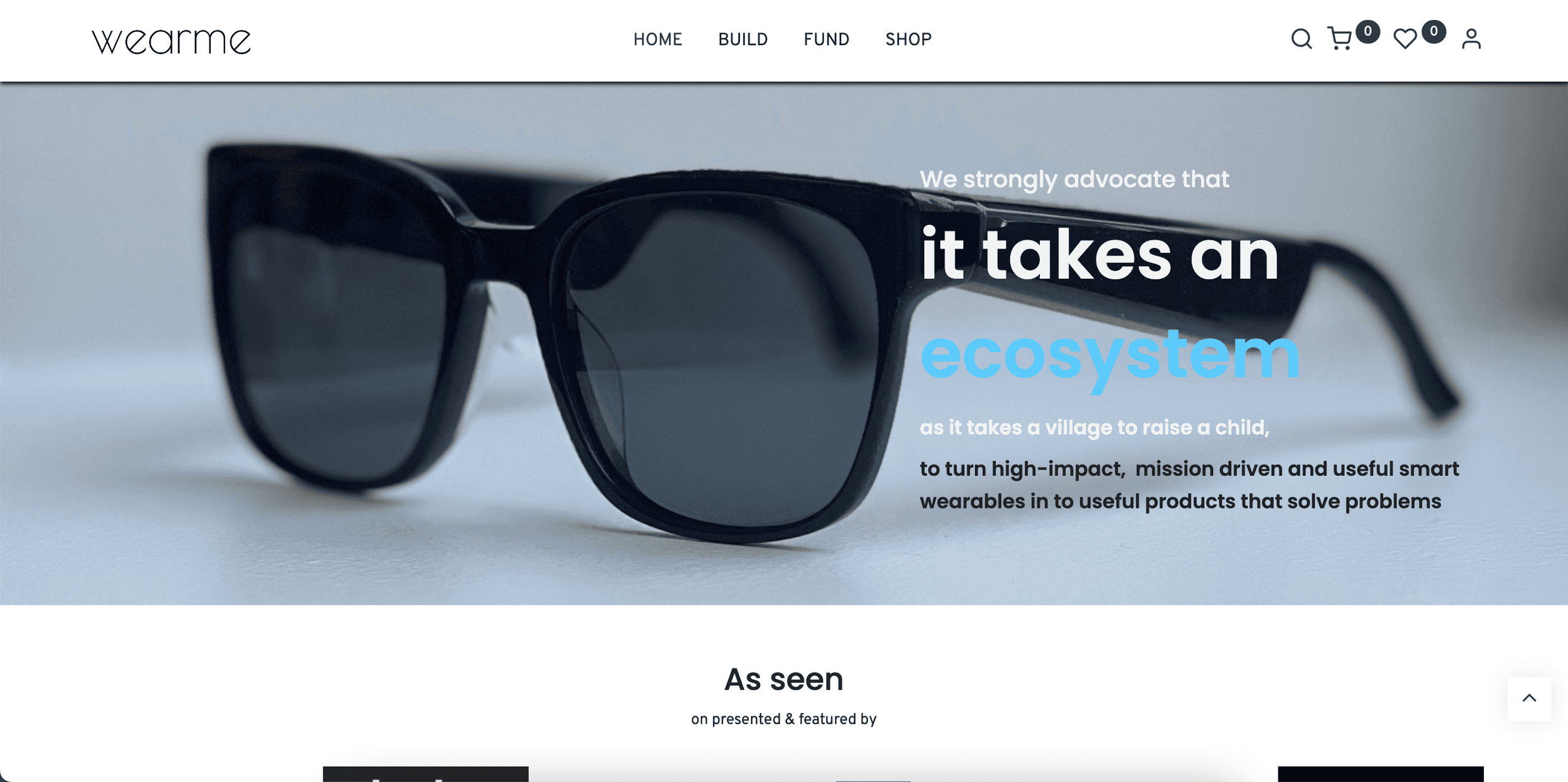
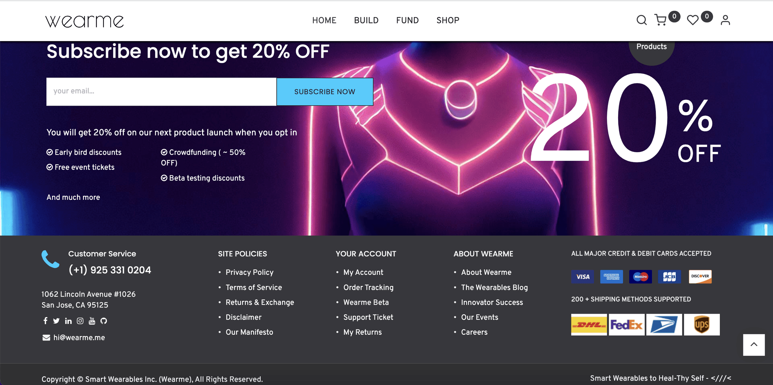
original landing page (parts of it)
The original website talked about a variety of topics, making it hard to understand what the company really did. The use of certain images made it seem like the company worked in the gaming space (it doesn’t).
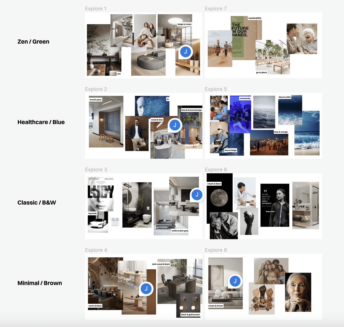
rebranding moodboard
After learning more about the CEO and his vision, I realized that my initial impressions from the website were completely off. I explained why it was important for us to rebrand and put together a moodboard to help guide the new direction.
initial design
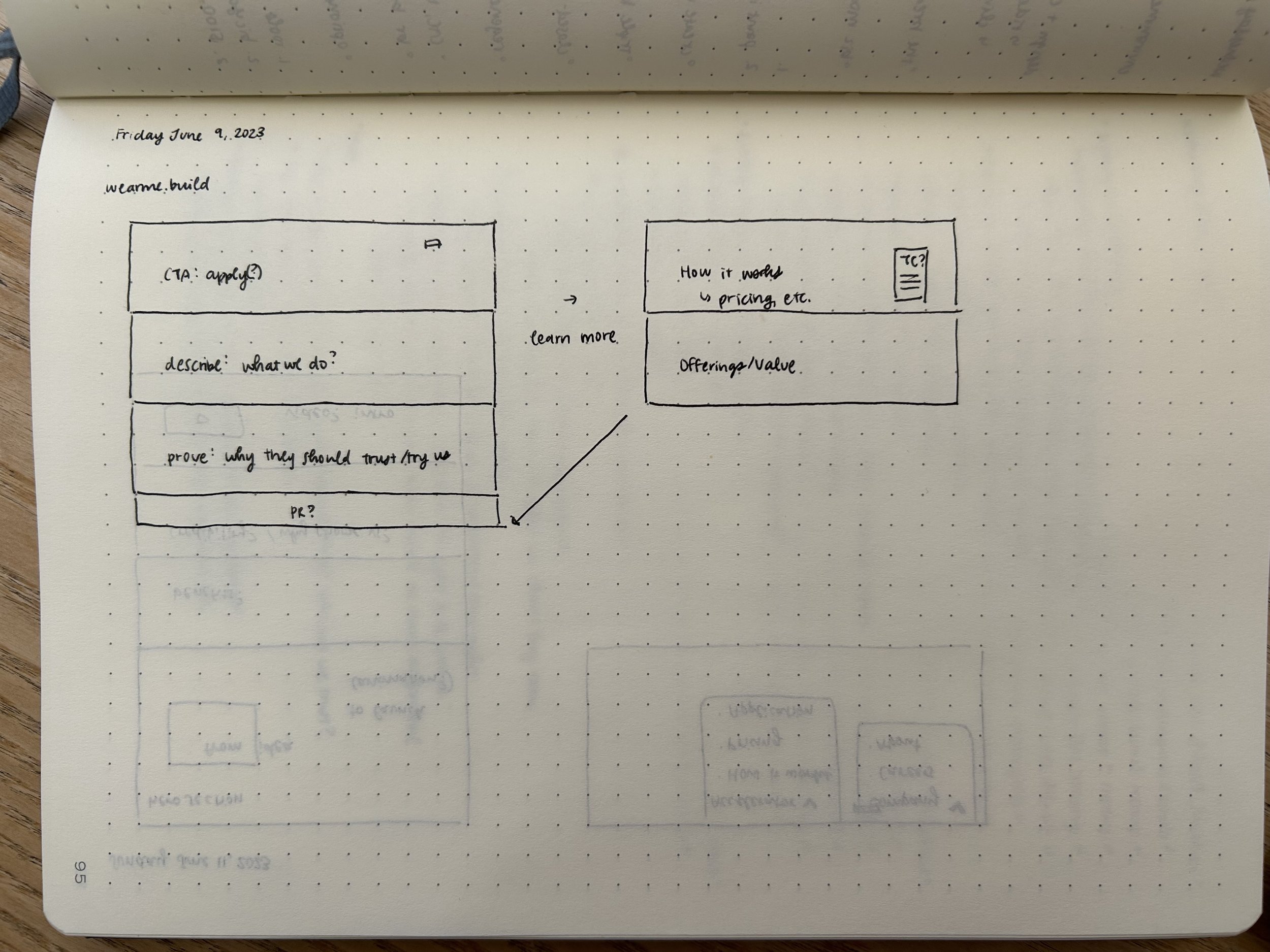
wireframe sketch
After talking about our target customers for one of our businesses, the CEO had a new idea: Change our model to be the first wearables accelerator.
I looked at reputable accelerators like Y Combinator to see how they structure their landing pages.
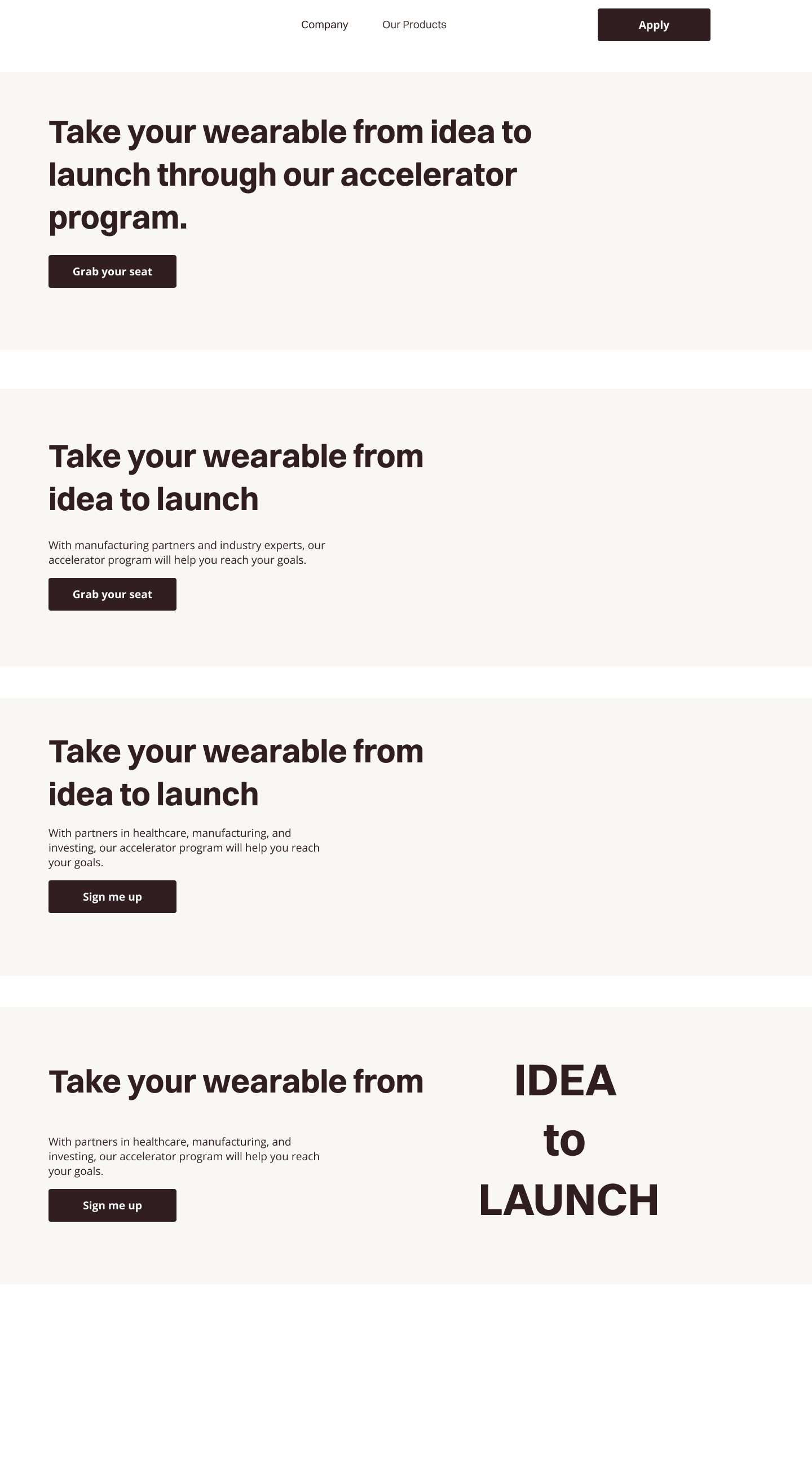
hero section copy
The hero section doesn’t have many words—only seven.
Packing a meaningful message within a few words always takes more work than it looks!
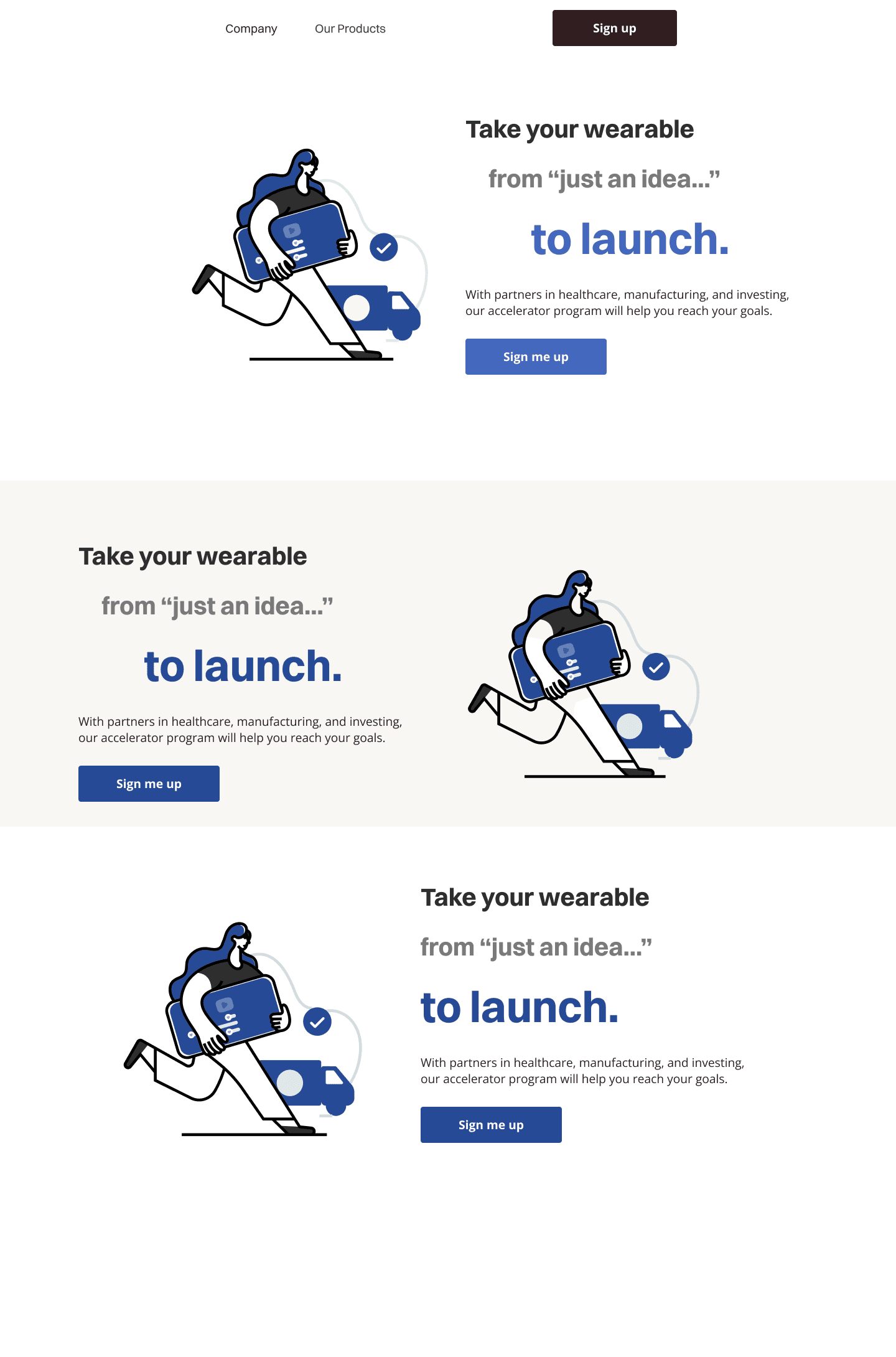
illustration exploration
Illustration explorationI explored the use of illustrations in the hero section because
1.) tech companies commonly use them, and
2.) illustrations represent a commitment to diversity.
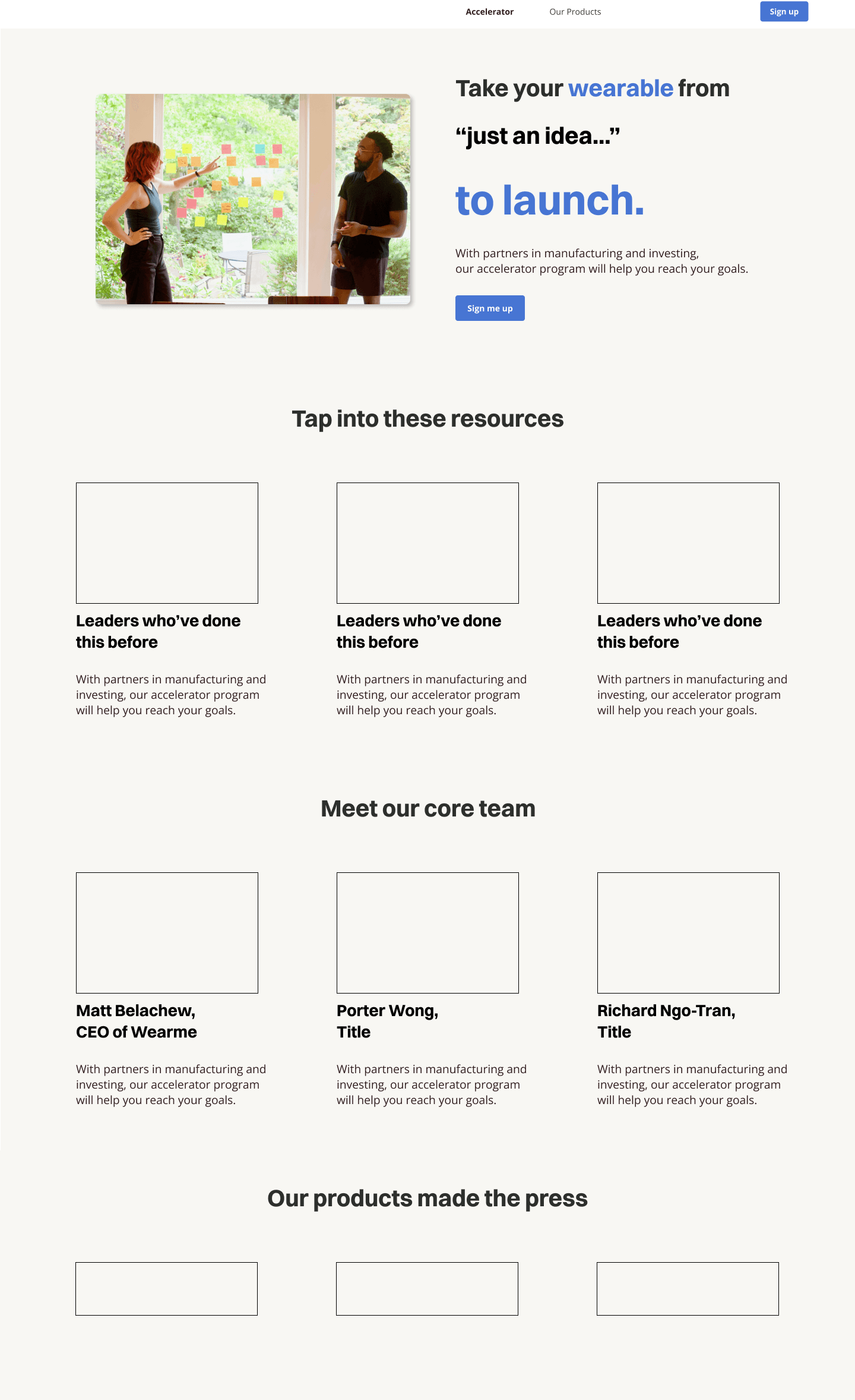
landing page layout
After going through many iterations of the hero section in both copy and visuals, I laid out the general content of the landing page.
final designs: figma handoff
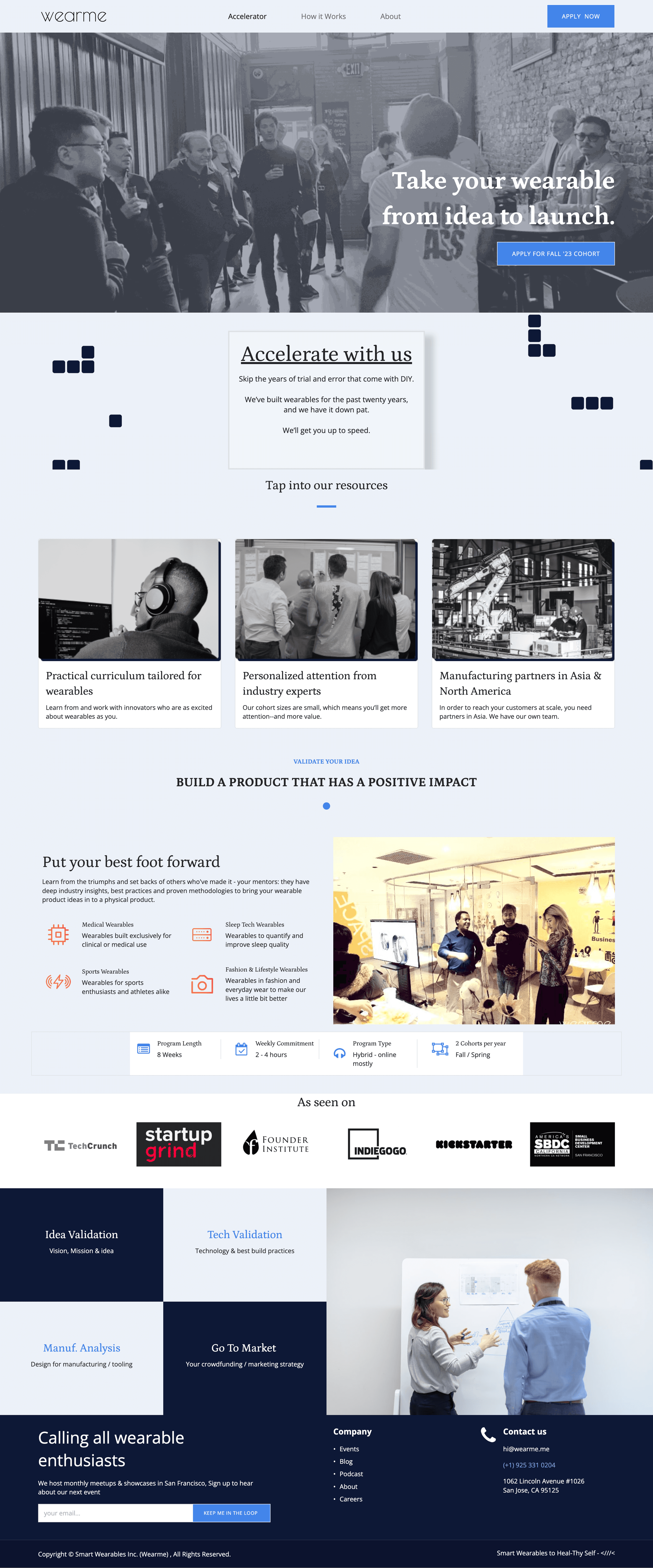
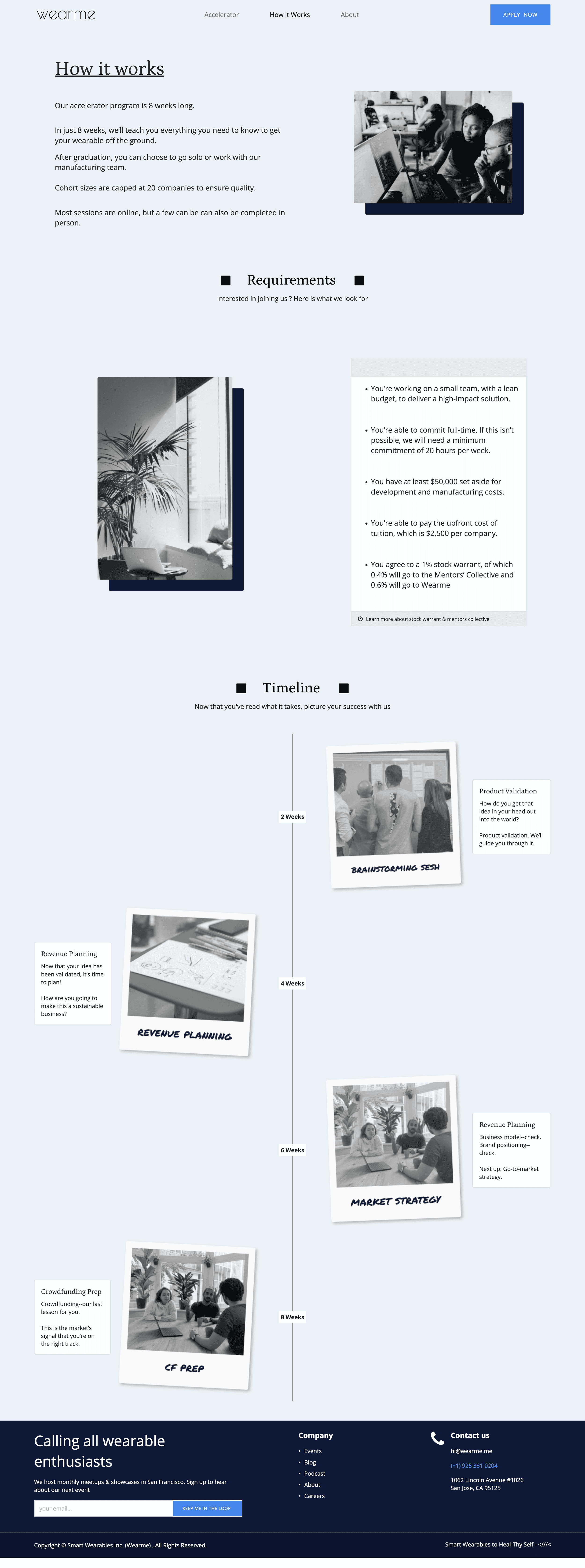
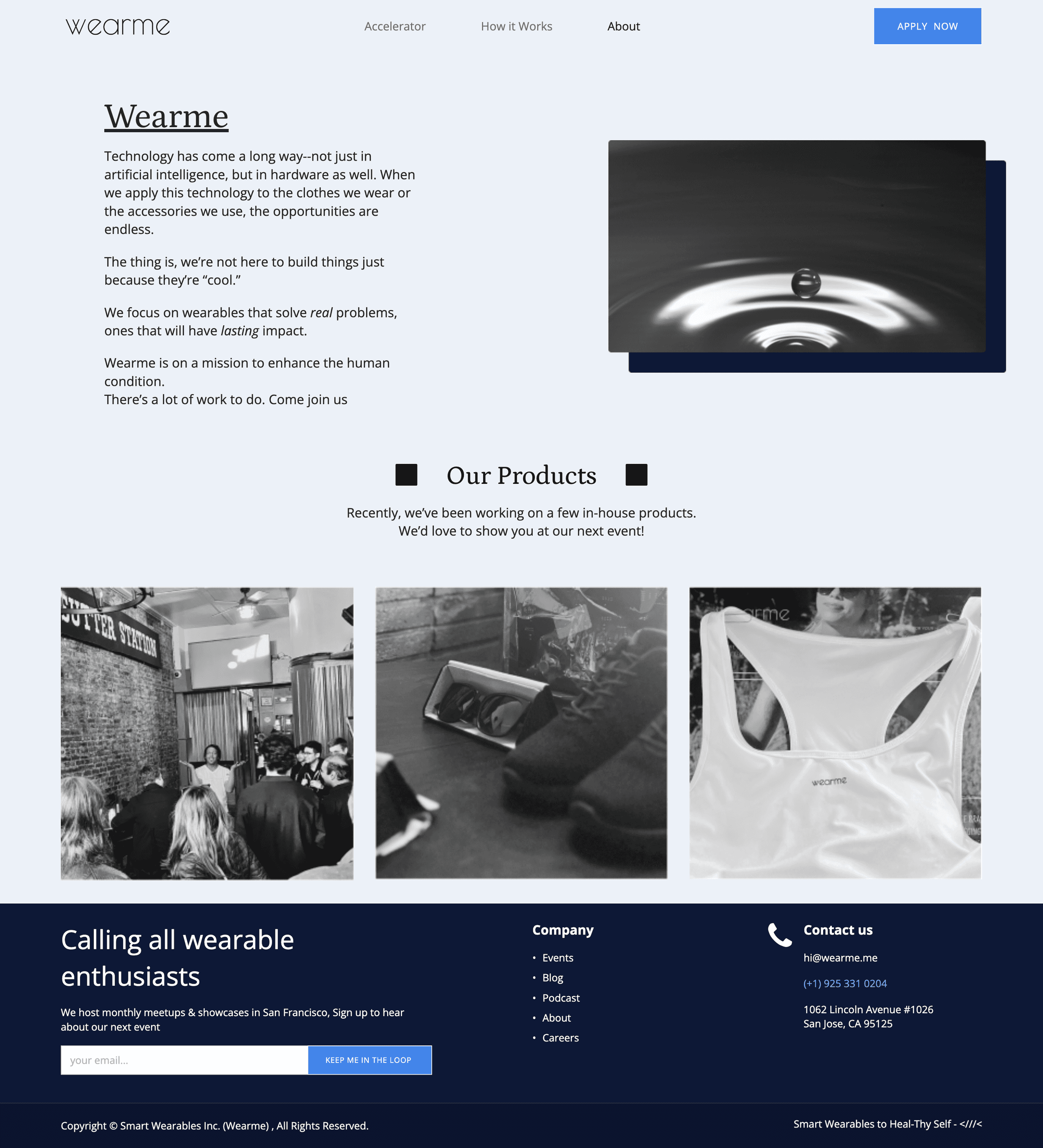
The developer—who was also the CEO—had some of the final assets for our newly created accelerator program. This is why the landing page has some placeholders.

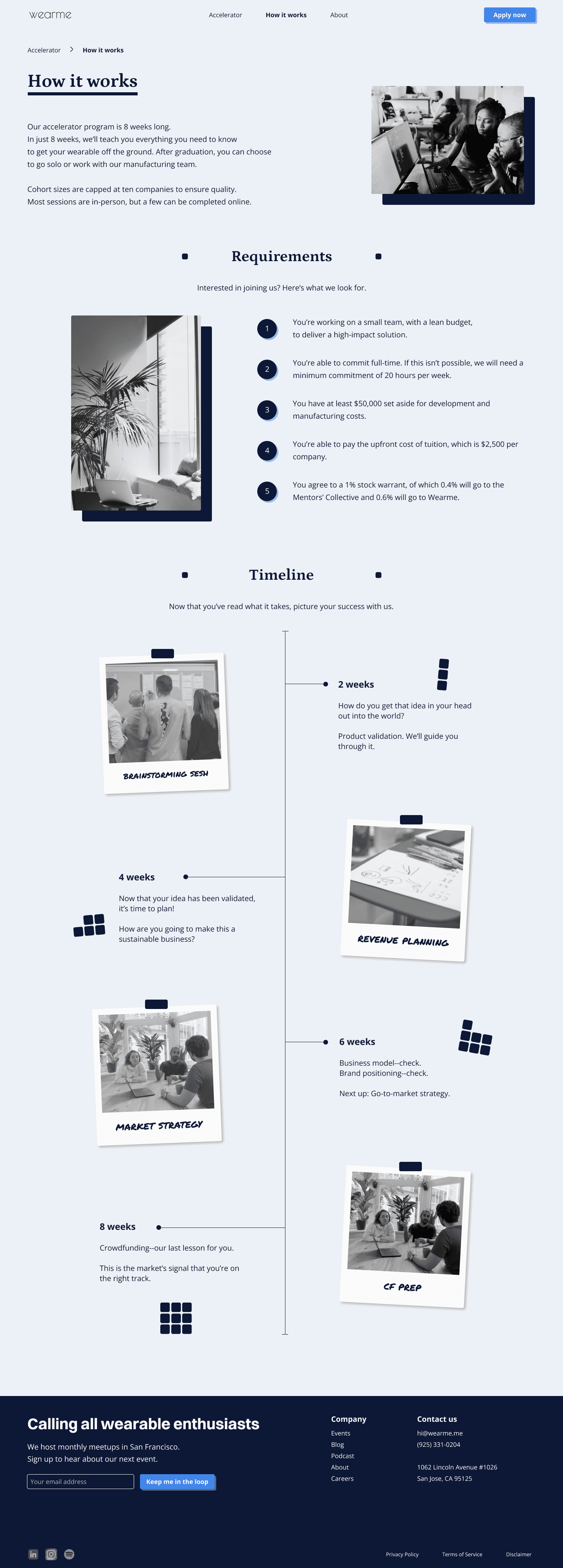
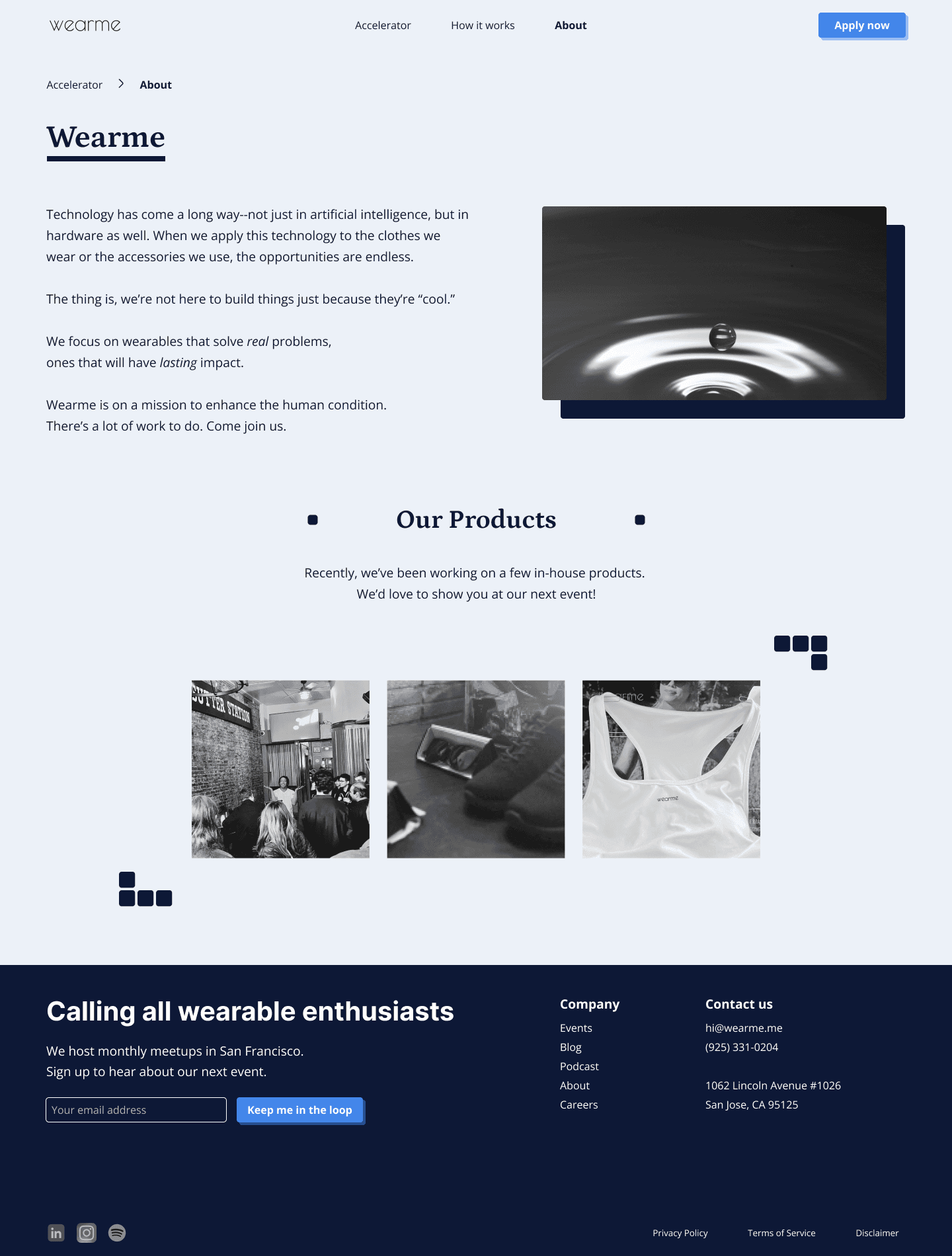
final designs: developed
The CEO was constrained for time and unable to develop Figma files 1:1. I’m currently learning more about Zeplin so that future handoffs can be more effective.
⛰️
challenges
The main challenge of this project was that this startup was in the early stages of doing multiple things at once.
Designing with a clear audience and goal in mind was difficult because we had multiple audiences and multiple goals.
Ultimately, we had to set priorities and agree to iterate over time as we introduced more of our product offering.
💭
reflection
This project reminded me of the importance of navigation bars. Intuitive navigation looks simple, but they’re often the result of goal-oriented planning.
Nav bars—or information architecture—are crucial in helping first-time visitors navigate your website and understand what you do.
They can also have a significant impact on future design and development work.
create with me
I'd love to help.