
payment flow {
reduce withdrawal errors and fees }
before

problem
The current radio choice design makes it too easy for customers to accidentally choose the wrong option. They might only want to pay the regular monthly amount (around $200), but the lack of vertical spacing and user friction leads them down the path of withdrawing more than $23,000 from their bank account.
after

draft solution
Expand the user flow to reduce the chance for error. A payment process that starts by choosing intent will guide customers down a clear path. Screens that follow will have copy specific to the selected intent, reassuring customers that they are paying exactly the amount they want to pay—no more, no less.
background
For a loan servicing company, the customer payment portal and dashboard was difficult to use and navigate. Many customers relied on their mobile devices to access the portal, but the website is not mobile-friendly. Most pages were designed to be viewed on a desktop. This led to many customers accidentally withdrawing more money from their accounts than they intended and subsequently getting hit with overdraw fees from their banks.
my role
I took on the role of UI designer as well as content designer. I conducted user research, reorganized the information architecture, edited the copy, and created the designs.
These are early drafts. With more time, I would go through more iterations.
I conducted user research, reorganized the information architecture, designed the prototypes, and edited the copy.
These are early drafts. With more time, I would have gone through more copy revisions.
stakeholders
This was a personal project I took on because I’m passionate about UX and wanted to help solve the problems I saw. I discussed these designs with the Head of Engineering and the CEO.
constraints
Since my official role was in customer support, I worked on this UX project in addition to normal work hours. I would have liked to work on different features at once, but I had to prioritize based on what was most urgent. I finished this prototype within 3 weeks.
📝
process
My “day job” in customer support was great for conducting user research. I was mainly responsible for answering inbound phone calls from customers. When you talk with customers for 8 hours a day, everyday, you get both depth and breadth in understanding their struggles.
As a CS representative, I knew which questions were most common, which issues were most urgent, and which were most important to address long-term—and where our CRM tool was lacking.
My creative process was simply “iterate, iterate, iterate.” In technical terms, I used a lean UX approach. I started with general ideas of what was needed, gradually narrowed my focus to flesh out the most urgent features first, and refined the copy last.
original payment flow

error-prone
This is a high-stakes screen. Customers are asked to choose their payment amount, their bank account, and understand how their payment will be applied. All they have to do is select a circle or two.
confusing
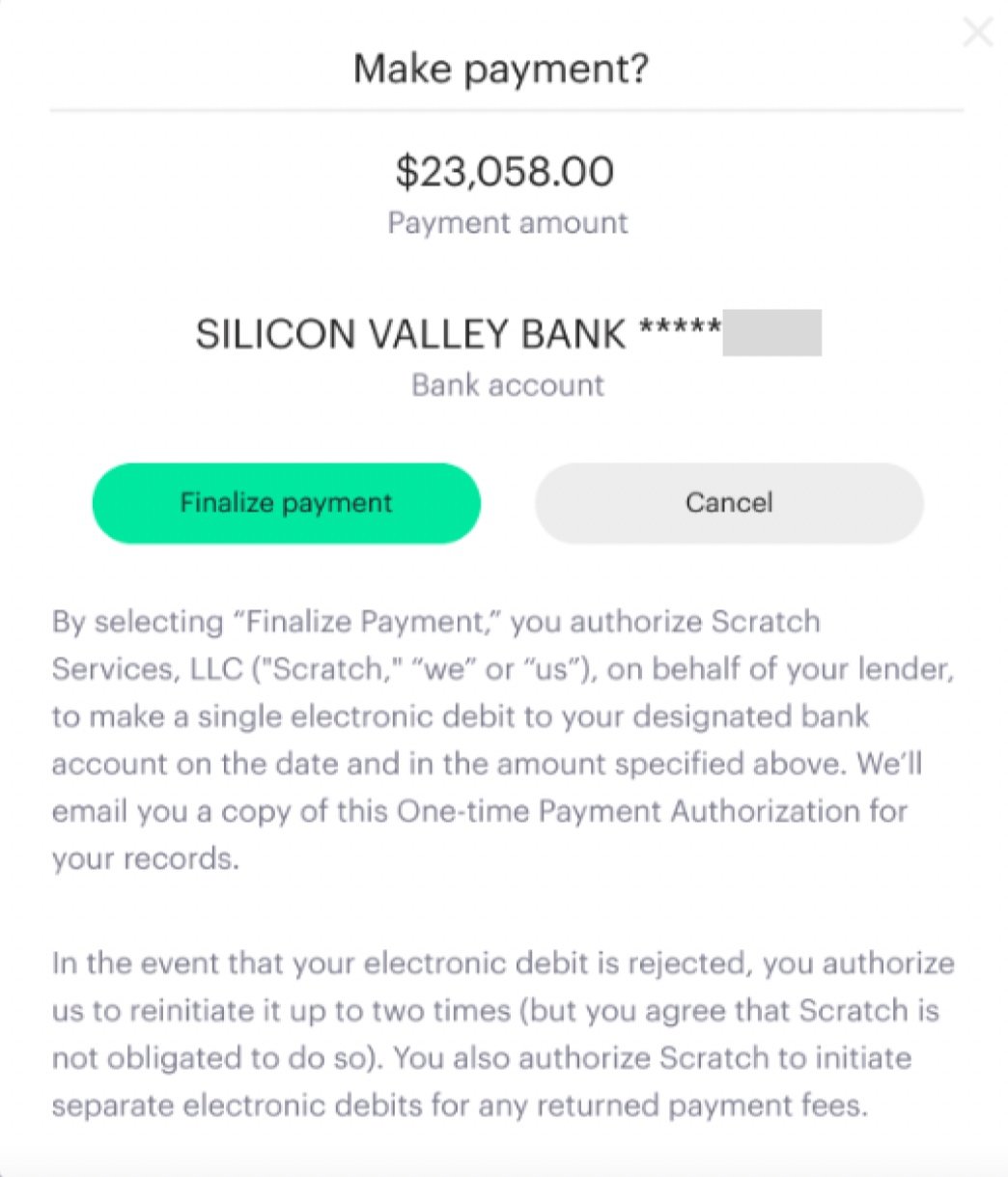
Usually, the button to continue a process is on the right-hand side. If customers are moving out of habit, they could hit “Cancel” when they don’t mean to. Not a costly mistake. But, if they realize they chose the wrong thing on the previous screen and want to go back, they might hit the “Finalize payment” option by accident—either because they’re used to “Back” buttons being on the left or because the button is in neon green.
misleading
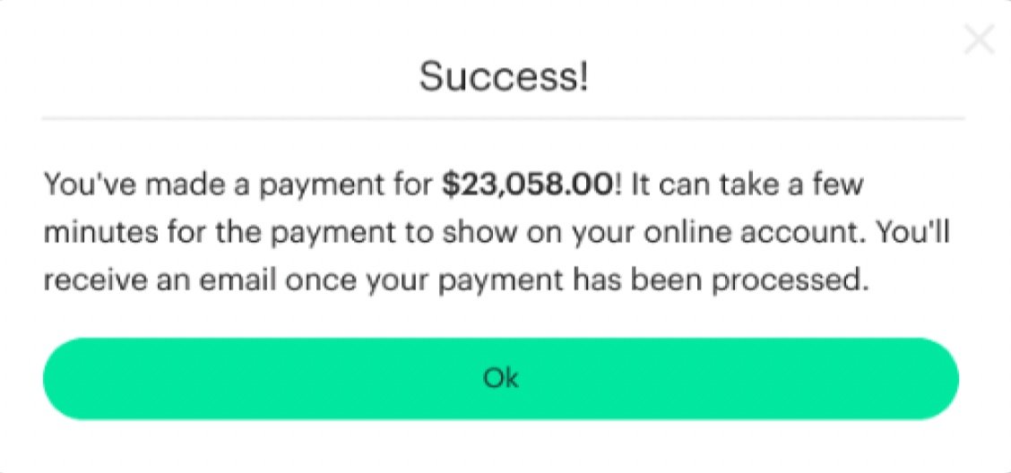
This leads customers to think that everything worked out. But in reality, it’s too soon to say. Payments can fail if customers don’t have enough funds in their account (or a variety of other reasons). This message gives customers a false sense of security when it should be giving them a more accurate representation of the process.
new subflow

draft
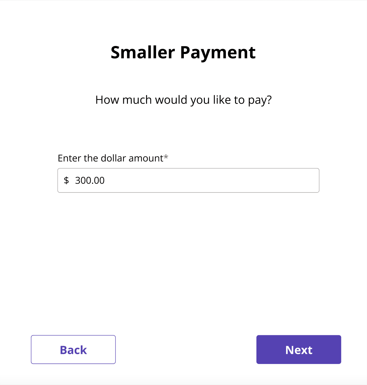
For customers who want to make a payment that’s less than their monthly bill, label the option as “Other.”
title
Change the title so that customers can clearly see what type of payment they are making.

review
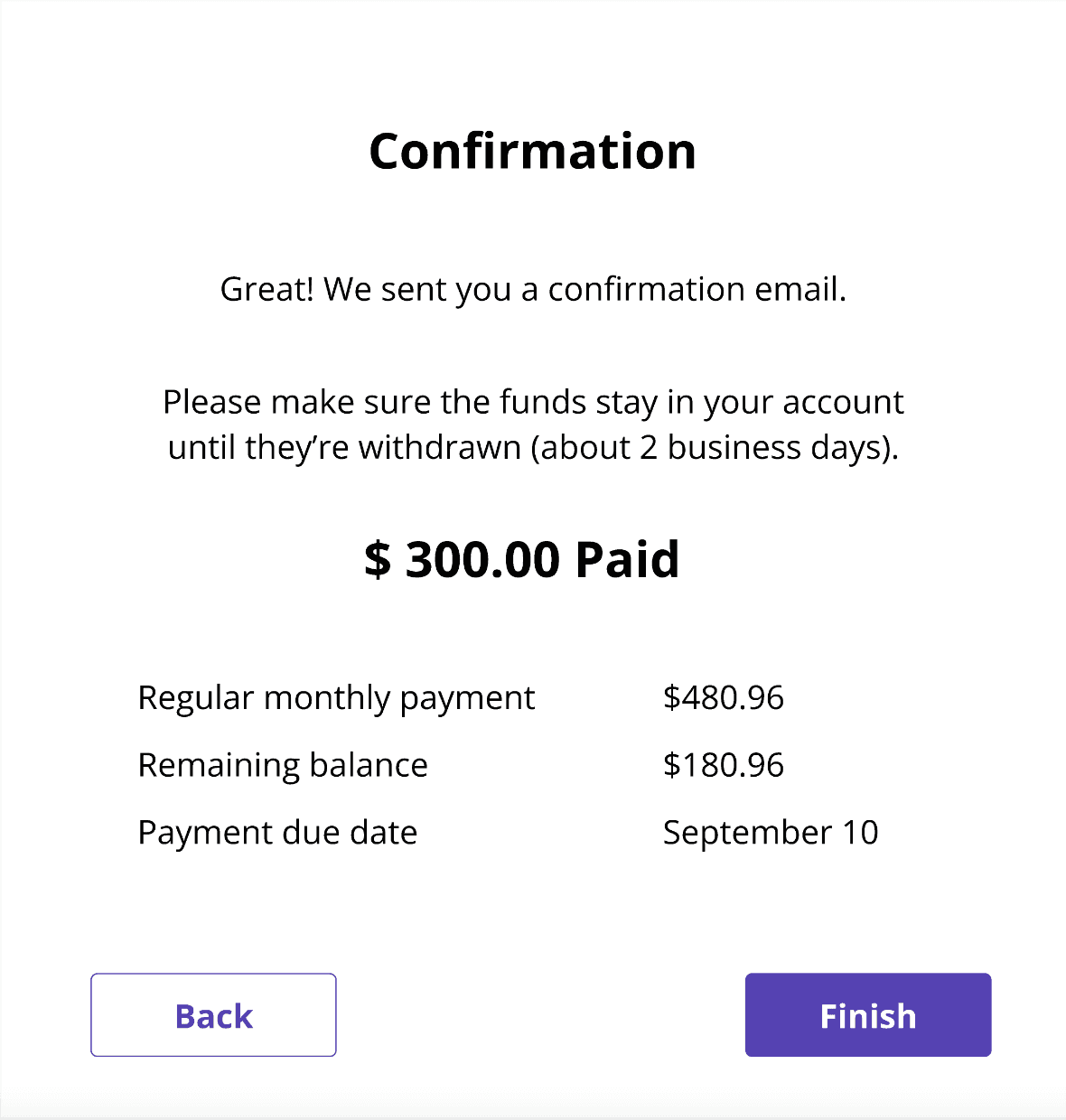
Give customers a clear view of how much they are about to pay by making the amount big and bold.
reminder
Tell customers how long they need to keep the funds in their account so they don’t overdraw (which happens often).
copy revisions
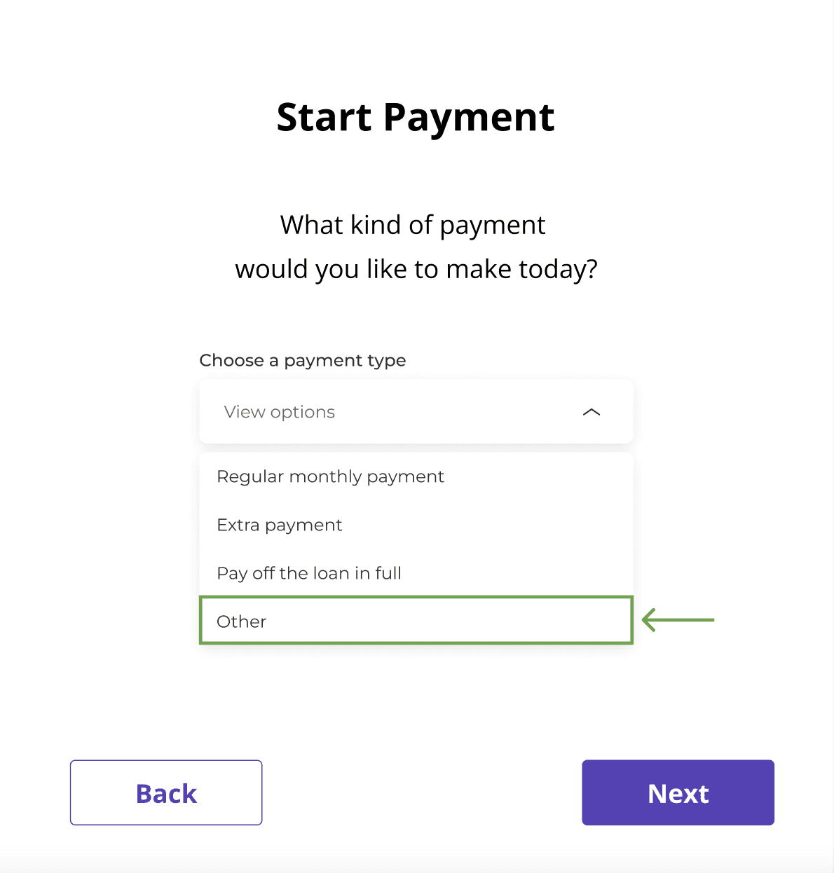
draft
I wanted to create an option for customers to pay a smaller amount since this was a common request. Initially, I thought that using the word “Other” would help the user feel more dignity in a situation where they can’t afford to make the regular monthly payment.
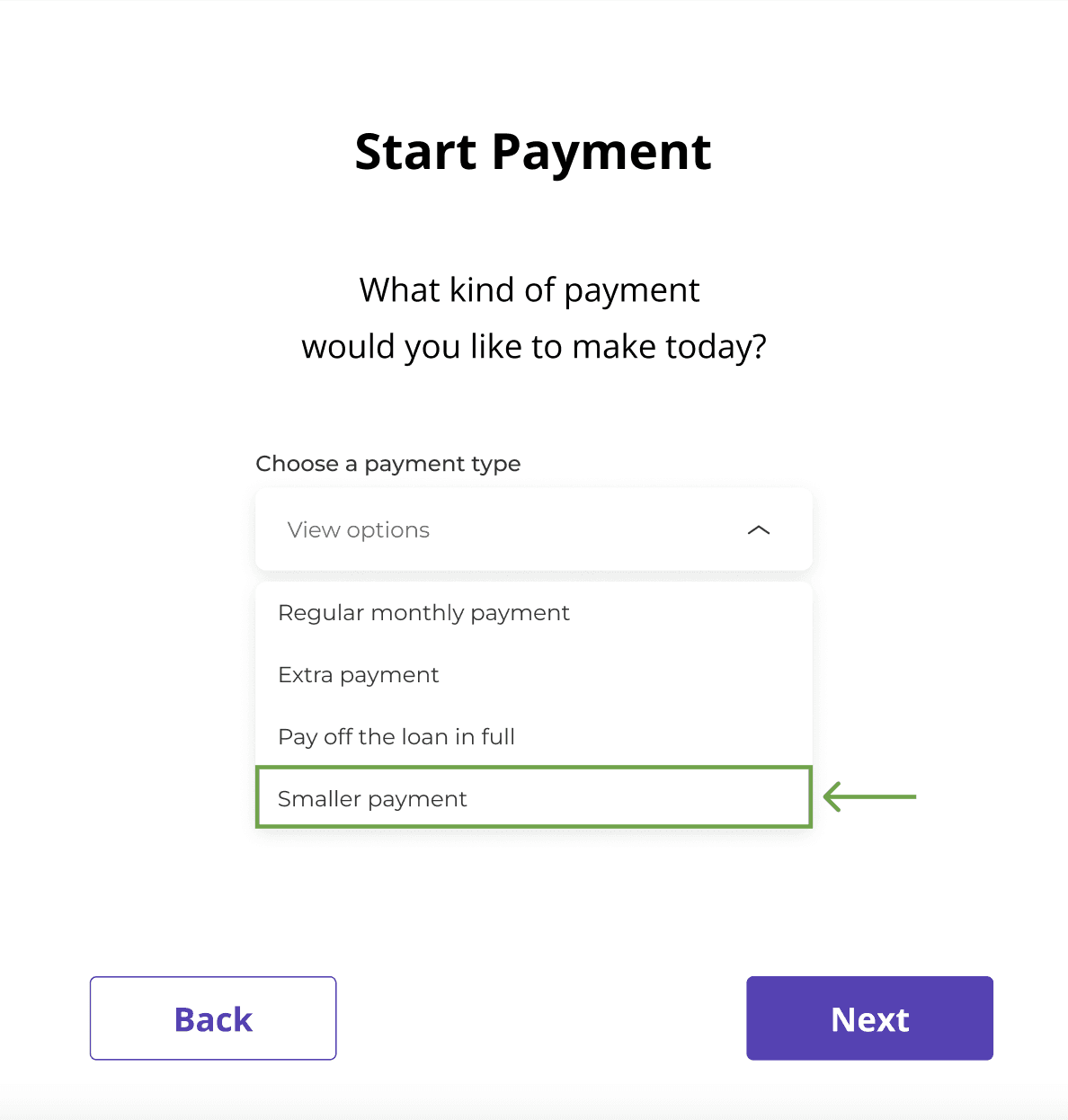
revision 1
In reality, most customers don’t think in terms of “Other.” They think and say, “I want to make a smaller payment.” I decided to change the label to match the other choices and what customers commonly ask for.
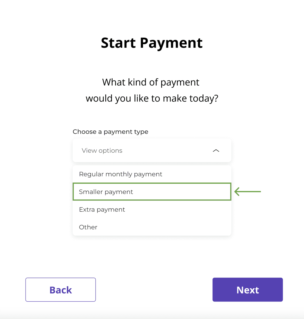
revision 2
There are far more customers who want to make a smaller payment than there are customers who want to pay off the loan. I decided to move the “Smaller payment” choice up the menu to match the volume of requests. I brought the “Other” label back since it includes the option to pay off the loan.
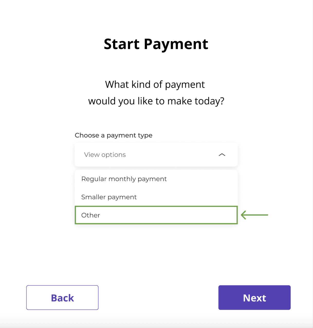
revision 3
The “Other” label is broad so I decided to simplify the menu from 4 options to 3.
prototype
🍕
results
I ran these high-fidelity drafts by the Head of Engineering (and really enjoyed talking with him about UX). He suggested bringing in the CEO at this time for direction.
The CEO gave the green light to keep iterating. He wanted to see more wireframes to have more options.
I wasn’t able to finish this project because I left the company.
create with me
I'd love to help.