
login flow {
reduce credit reporting errors }
before
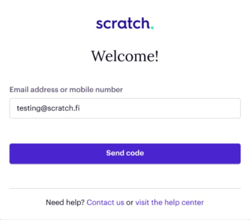
problem
People make new email accounts or change their phone numbers (almost) all the time. With the current login flow, customers can’t move forward if they no longer have access to the email or phone number they had when they applied for the loan. They need to call Customer Support and get a live agent to help them login.
after
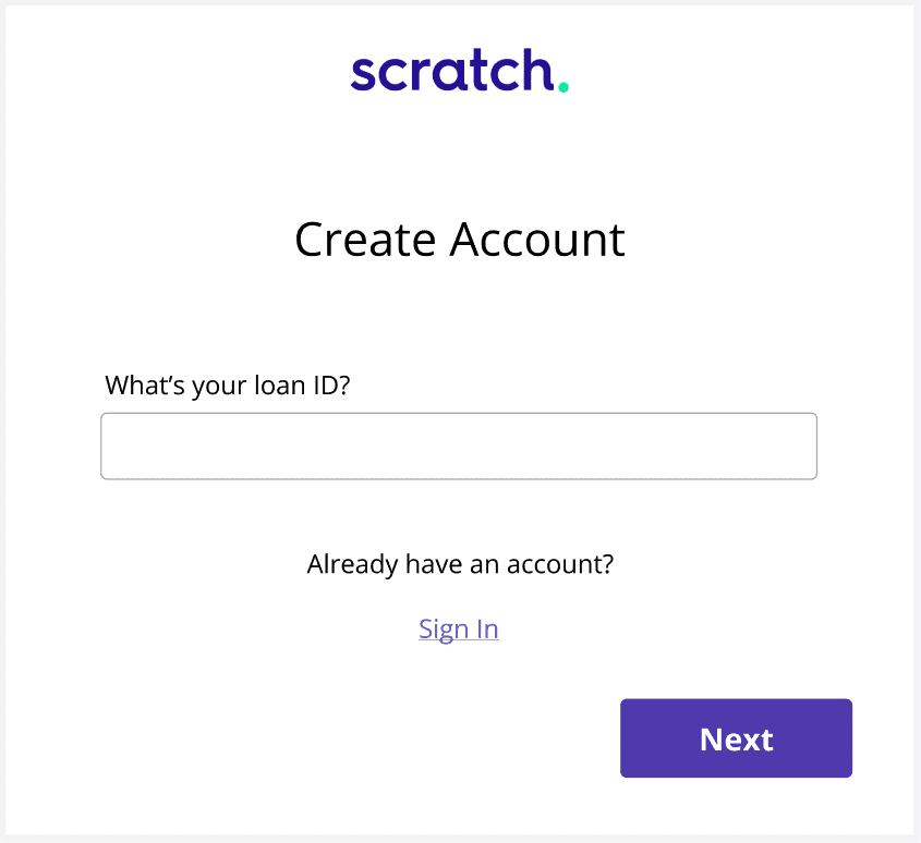
draft solution
Loan IDs never change, and customers can almost always find them. Starting with this question would help customers login (or create an account) more easily.
background
Hundreds of customers forgot their login credentials, and the current website design, copy, and user flow blocked them from accessing their accounts, receiving important information about their loans, and making payments in a timely manner.
This resulted in a variety of problems: notably customers getting dinged on their credit report and support agents spending hundreds of hours troubleshooting login issues before having to escalate them to Engineering.
my role
I took on the role of UI designer as well as content designer. I conducted user research, reorganized the information architecture, edited the copy, and created the designs.
These are early drafts. With more time, I would go through more iterations.
I conducted user research, reorganized the information architecture, designed the prototypes, and edited the copy.
These are early drafts. With more time, I would have gone through more copy revisions.
stakeholders
This was a personal project I took on because I’m passionate about UX and wanted to help solve the problems I saw. I discussed these designs with the Head of Engineering and the CEO.
constraints
Since my official role was in customer support, I worked on this UX project in addition to normal work hours. I would have liked to work on different features at once, but I had to prioritize based on what was most urgent. I finished this prototype within 2 weeks.
📝
process
My “day job” in customer support was great for conducting user research. I was mainly responsible for answering inbound phone calls from customers. When you talk with customers for 8 hours a day, everyday, you get both depth and breadth in understanding their struggles.
As a CS representative, I knew which questions were most common, which issues were most urgent, and which were most important to address long-term.
My creative process was simply “iterate, iterate, iterate.” In technical terms, I used a lean UX approach. I started with general ideas of what was needed, gradually narrowed my focus to flesh out the most urgent features first, and refined the copy last.
original login flow
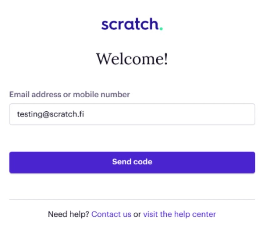
not helpful
There is both too much and too little information. The field label mentions 2 options, but many customers only read the first one: email. In practice, email is the more buggy, less reliable option. The button says “Send code,” but there’s no additional information about a “code.” Customers who are not tech-savvy get confused as to whether they should click this button or not.
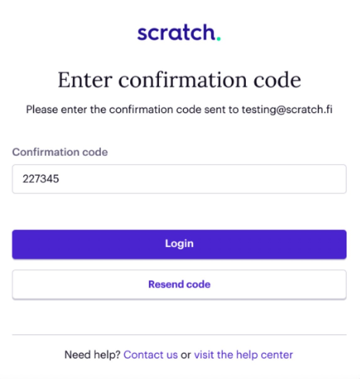
missing option
If the code doesn’t work, the customer is given 3 choices: resend the code to their email address, contact Customer Support, or visit the Help Center. But, there’s a fourth choice that’s missing. Previously, the site told customers they could put in either their email or phone number. There should be another option on this screen that reminds and allows customers to send the code to their phone instead.
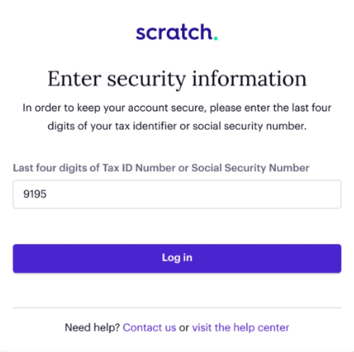
hidden trap
The customer is again given two options: use either their Tax ID number or their Social Security Number (SSN). It seems like either one could be used, but that’s not true. Customers whose accounts are tied to their Tax ID number will get locked out if they put in their SSN. This type of lock out can’t be resolved by the Customer Support team—it has to be reviewed and fixed by engineers.
new subflow

title
Customers aren’t aware that they already have an account with us (as the loan servicer, we needed to add their loan to our system in advance). They expect to “create an account.” Meet them where they are for a smooth experience.
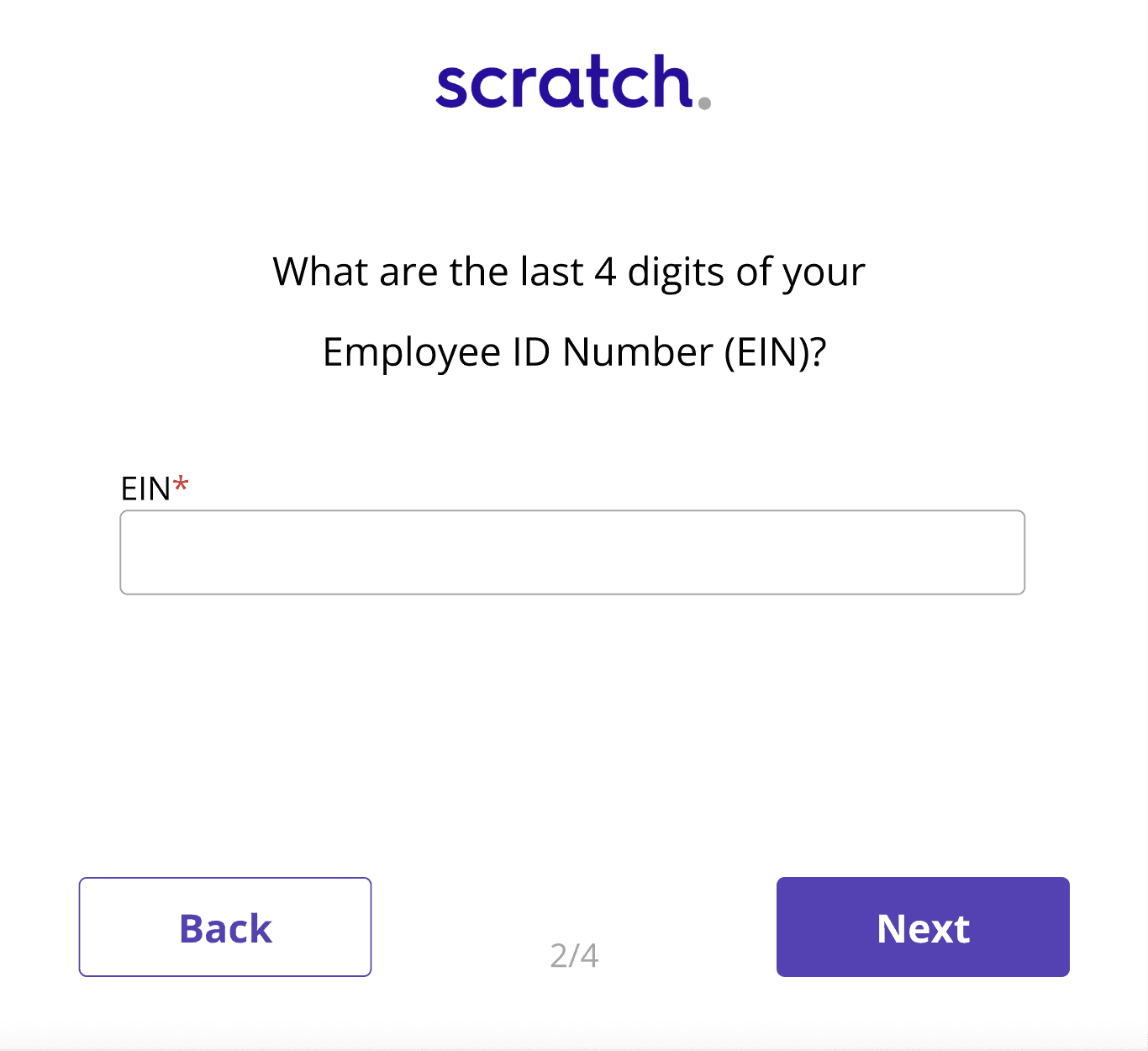
specify
Rather than telling customers they can put in two different answers that would lead them down two different paths, choose one for them.
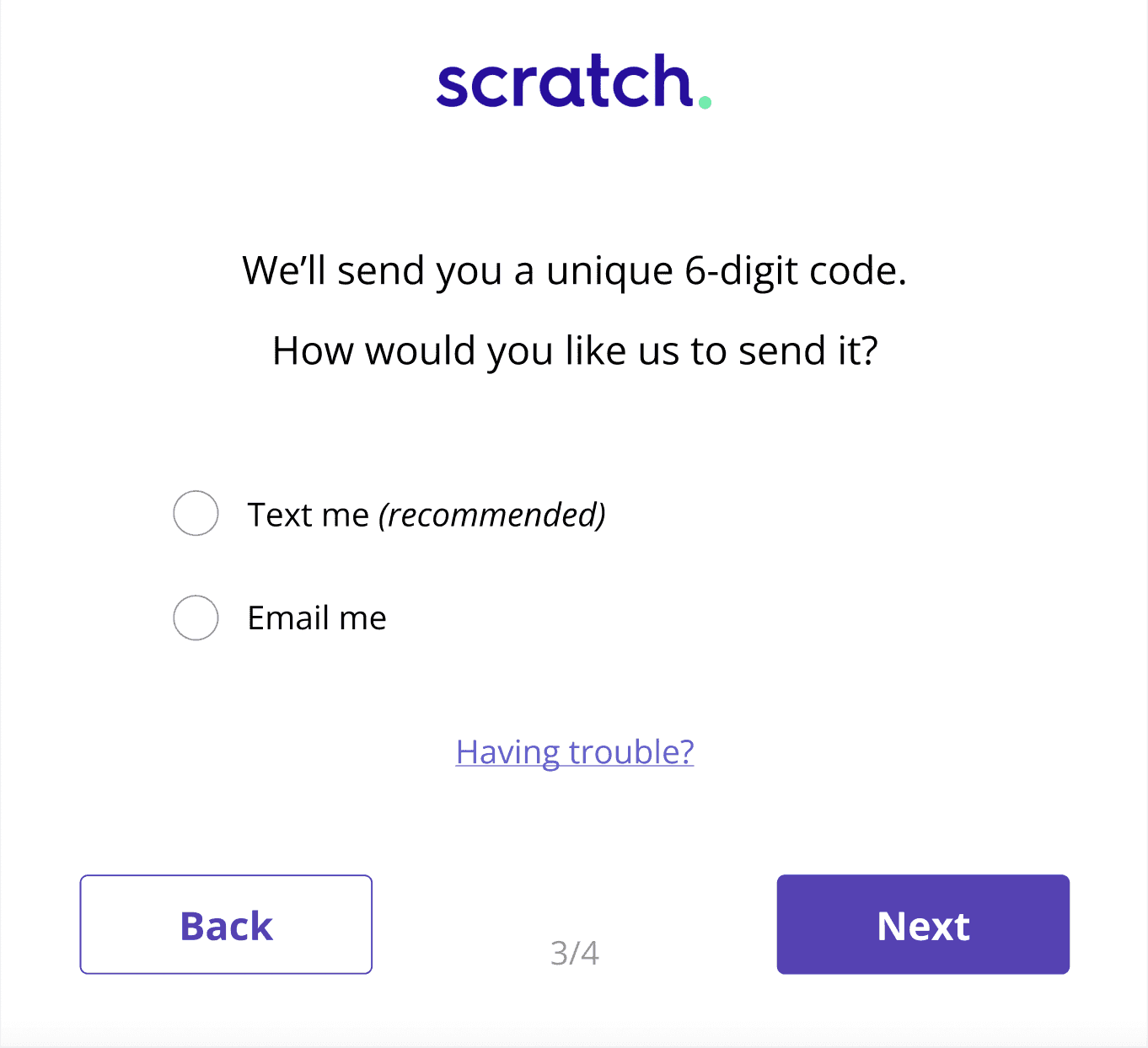
recommend
Customers frequently complain that the email option doesn’t work. Knowing that this is a common issue, recommend the easier choice for new customers.
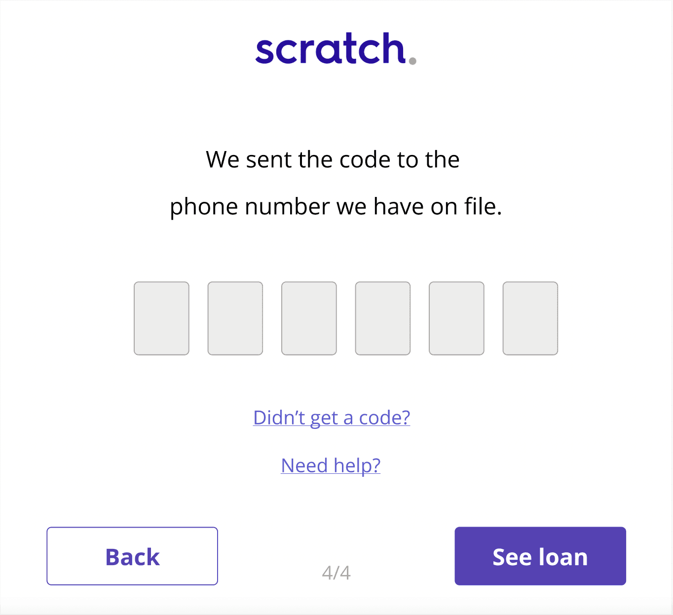
explain
A large portion of the customer base is older and/or not tech-savvy. Explain what just happened so they know where to look.
copy revisions
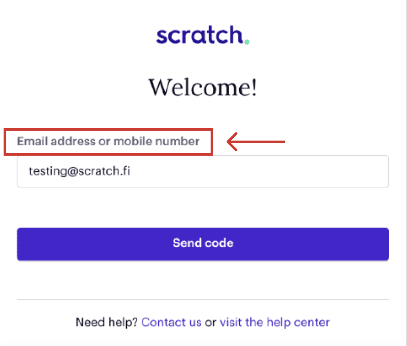
original
The main change I wanted to make in the login flow had to do with the first question. It would be more effective to ask for a loan ID instead of an email address or phone number. This is based on hundreds of calls I had with customers related to login issues.
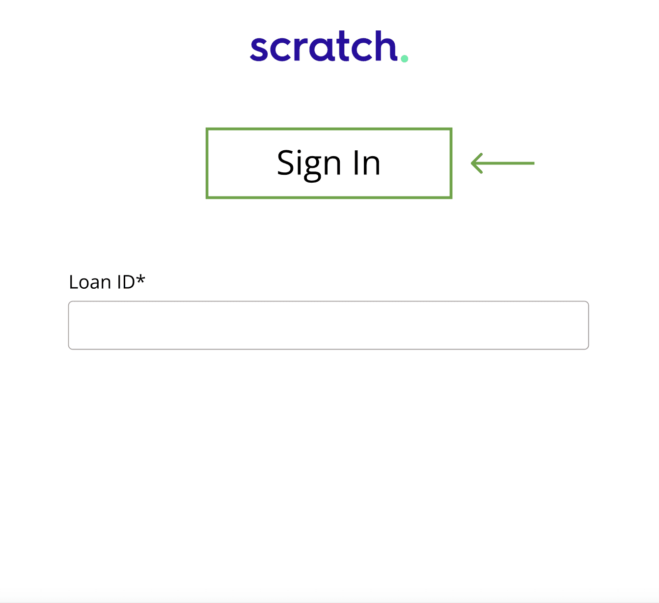
revision 1
I wasn’t quite sure what to put for the title. The title wasn’t nearly as important as the field label so I put “Sign In” as a placeholder.
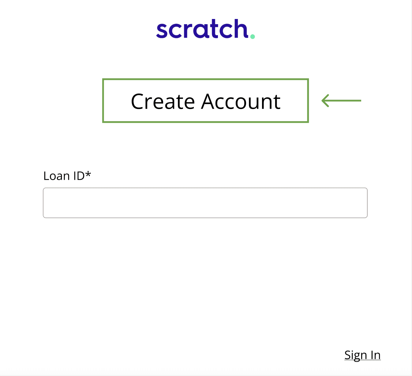
revision 2
After thinking about phone calls I had with customers, I realized that “Sign In” was a bad title. Many customers assume that they can’t “sign in” because they never visited our website before. These customers assume that they need to “create an account” so I changed the title to match their expectations.
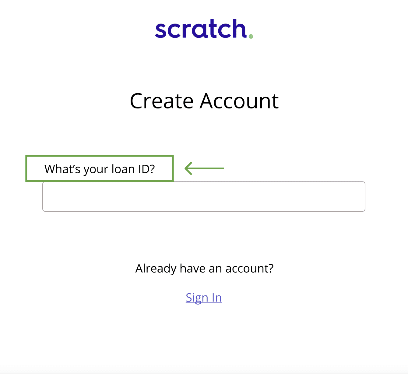
revision 3
I rewrote the field label as a question to give users more guidance. Going off of the “Create Account” idea, I also made a link for customers who had logged in before (“created an account”).
prototype
🍕
results
I ran these high-fidelity drafts by the Head of Engineering (and really enjoyed talking with him about UX). He suggested bringing in the CEO at this time for direction.
The CEO gave the green light to keep iterating. He wanted to see more wireframes to have more options.
I wasn’t able to finish this project because I left the company.
create with me
I'd love to help.