
crm dashboard makeover {
reduce billing errors, speed up internal workflow }
before
problem
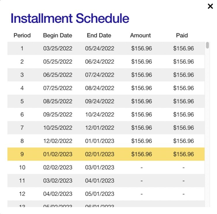
The “Installment Schedule” is a table that shows the scheduled payments for a loan and how much the customer has paid so far. The table doesn’t show historical information, like whether the account was ever considered “delinquent.” The design is too simple and doesn’t help support agents answer customers’ questions about their account status.
after
draft solution
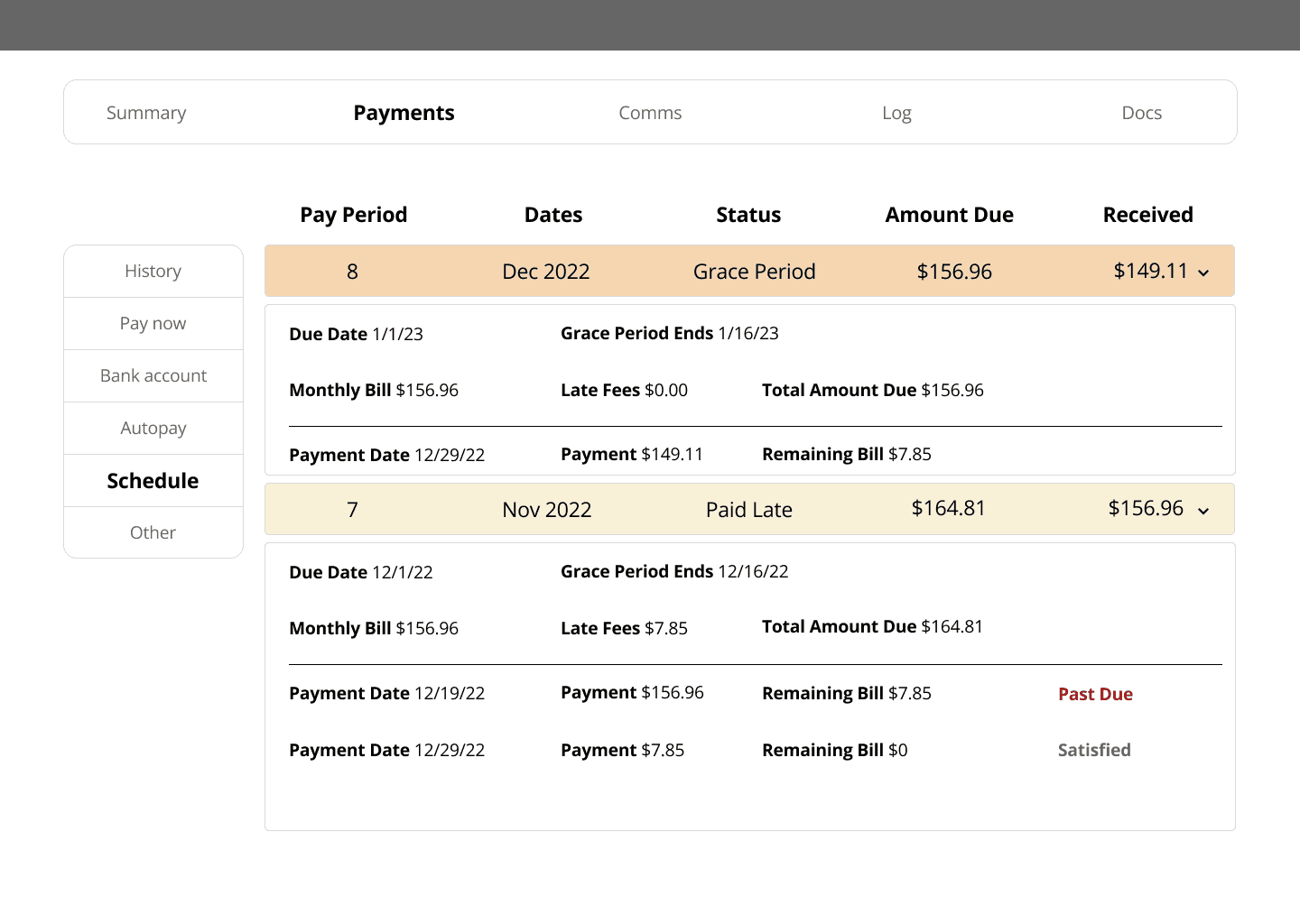
Expand the schedule view (in accordion format) to show which payments were allocated to the monthly bill. This would help customer service reps give a detailed breakdown of how customers’ accounts became “delinquent,” and when they became “current.”
background
The customer relationship management (CRM) tool is not user-friendly. Agents have to pull out calculators and take screenshots in order to answer common questions.
constraints
Since my official role was in customer support, I worked on this UX project in addition to normal work hours. I would have liked to work on different features at once, but I had to prioritize based on what was most urgent.
my role
I took on the role of UI designer as well as content designer. I conducted user research, reorganized the information architecture, edited the copy, and created the designs.
These are early drafts. With more time, I would go through more iterations.
stakeholders
This was a personal project I took on because I’m passionate about UX and wanted to help solve the problems I saw. I discussed these designs with the Head of Engineering and the CEO.
📝
process
My “day job” in customer support was great for conducting user research. I was mainly responsible for answering inbound phone calls from customers. When you talk with customers for 8 hours a day, everyday, you get both depth and breadth in understanding their struggles.
As a CS representative, I knew which questions were most common, which issues were most urgent, and which were most important to address long-term—and where our CRM tool was lacking.
My creative process was simply “iterate, iterate, iterate.” In technical terms, I used a lean UX approach. I started with general ideas of what was needed, gradually narrowed my focus to flesh out the most urgent features first, and refined the copy last.
wireframes
original
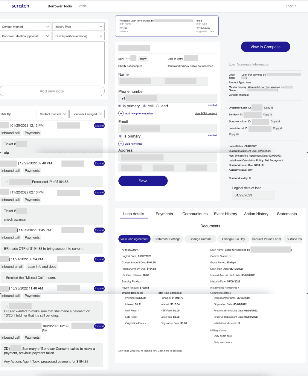
There are lots of different sections on the main dashboard—agent notes, customer information, loan information—and it’s very long. The horizontal lines/shadows in this screenshot indicate the end of the desktop view; the main dashboard takes 2.5 vertical desktops to see. This requires a lot of scrolling and important pieces of information get hidden—leading to more agent mistakes.
wireframe 1
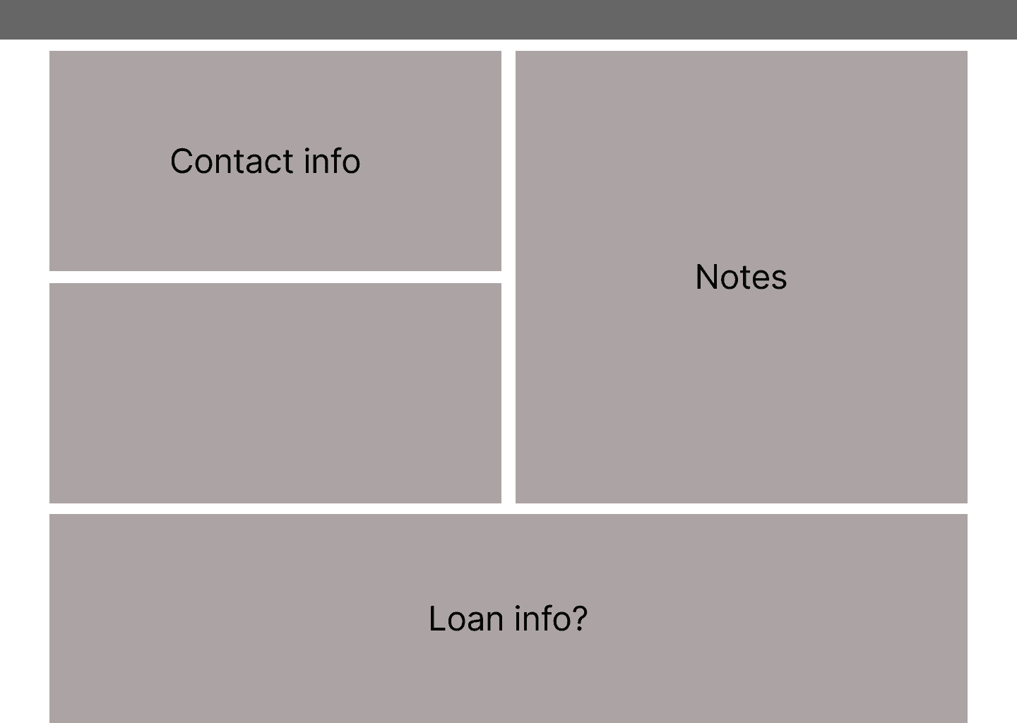
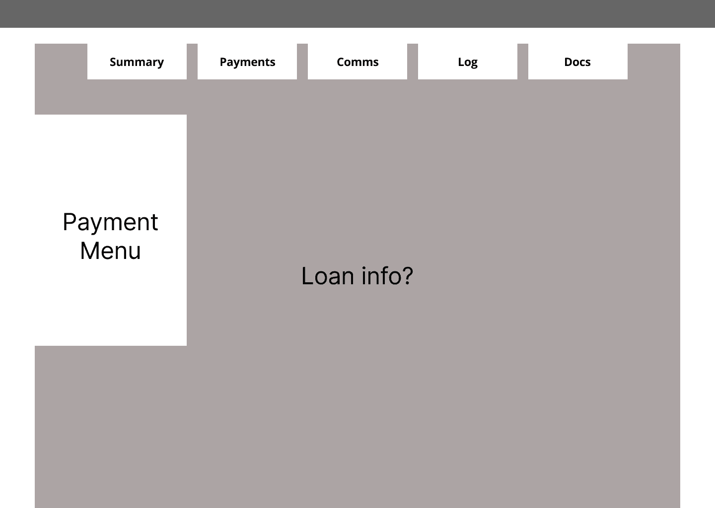
I tried to simplify the sections on the main dashboard. What did agents really need to see at first glance? “Loan info” refers to the bottom table in the original design that houses all of the payment information (and more).
wireframe 2
I decided to focus on the “Loan Info” in particular and revisit the main dashboard later.
design interactions

original
This is the most common tab agents look at when customers have questions about their account status. It shows when customers made payments. It doesn’t show enough information, however, so agents have to open the “Installment Schedule” which is under a button that’s under the “Loan Details” tab.
iteration 1
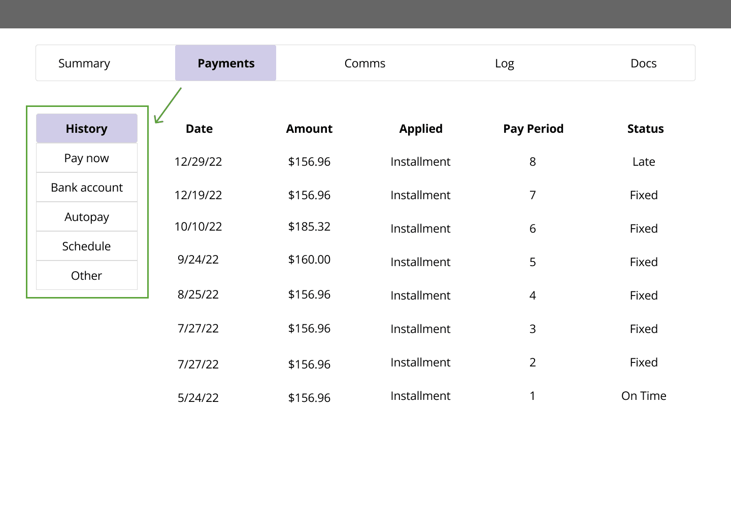
I tried to make the Payment History easier to read and more useful in terms of the information it provided. I took inspiration from the existing “Installment Schedule.” Ideally, all of the information needed for a single question could be found in one tab.
I also reorganized the information architecture and created a vertical sub-menu. This way, agents can scan vertically for different categories rather than horizontally for random buttons.
iteration 2
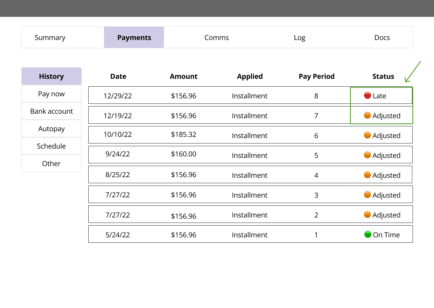
Payment history has a lot of information. I added colored dots to give a quick visual cue to agents as to which payments might be problematic.
I revised one of the statuses from “fixed” to “adjusted.” This status is meant to show the agent that the payment was previously considered delinquent, but has since been paid.
A pattern of colored dots could serve as a quick sign to agents that there is a recurring issue and point to when this issue started.
prioritization
iteration 3
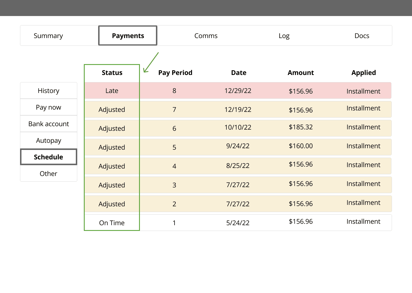
Rather than redesigning both the Payment History view and the Installment Schedule view at the same time, I decided to finish one first. In the previous iteration, I added bits of the Schedule view into the History view. That wasn’t enough information for agents to answer customer questions.
I decided to try the opposite idea: add bits of the History view into the Schedule view so that agents have a better understanding of how payments were allocated.
I also tried rearranging the columns so that the most important information was on the leftmost side: Knowing whether a payment was late is more important (and helpful) than knowing the exact date the payment was made.
iteration 4
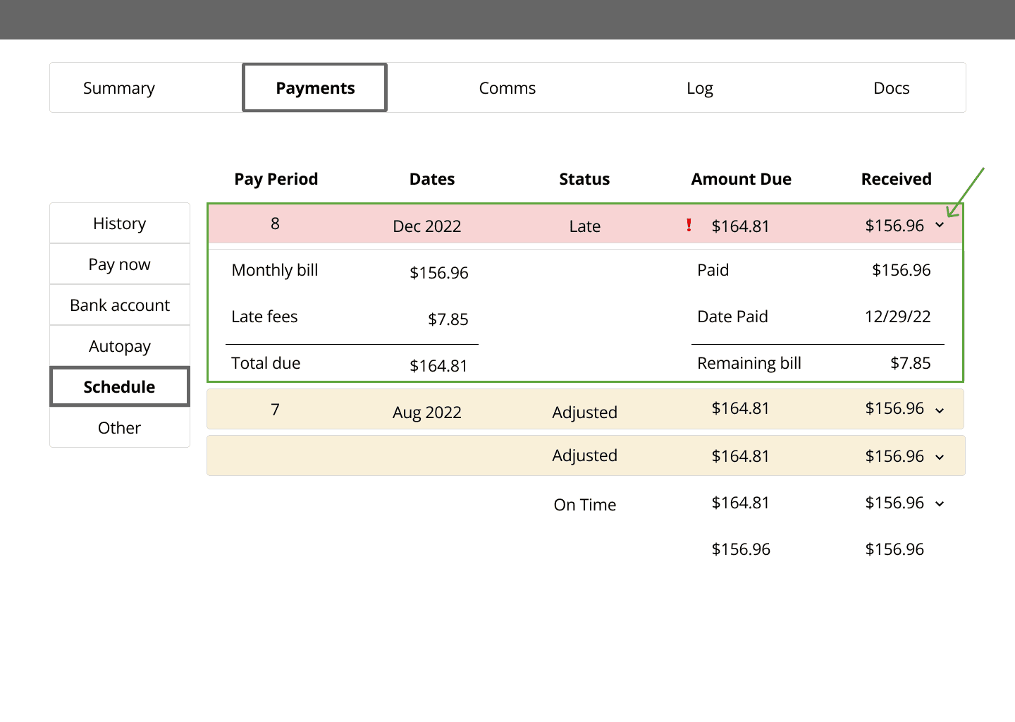
For the new Schedule view, I wanted to try an accordion format: a simple list to see high-level information at first glance and a detailed breakdown of the monthly bill when expanded.
iteration 5
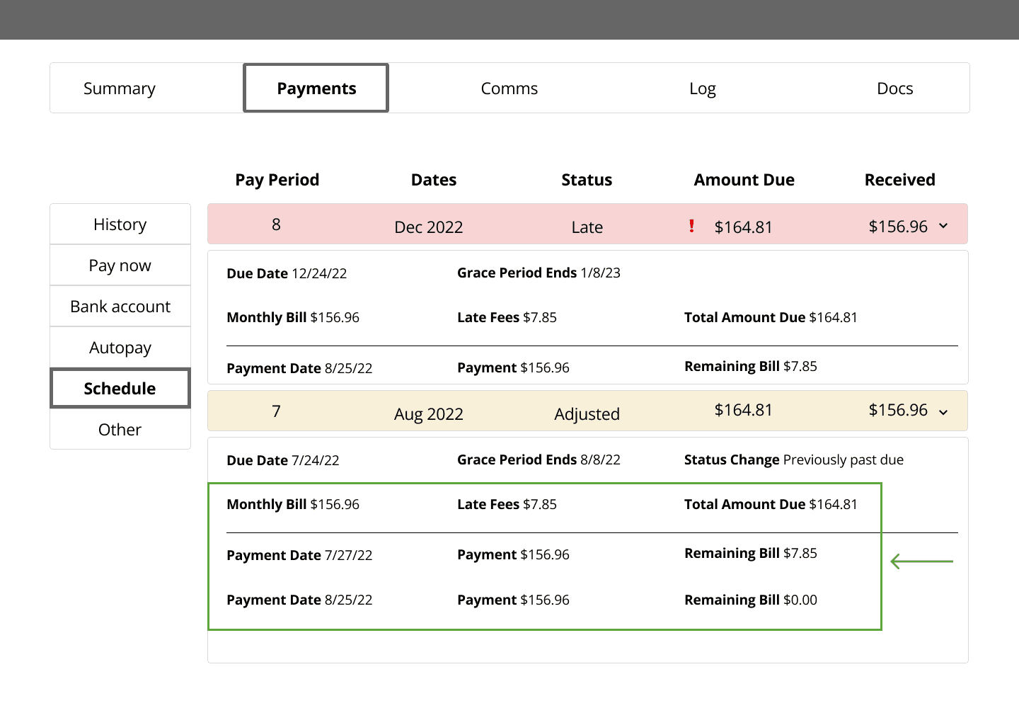
One of the common problems customers complained about (but that wasn’t apparent from our CRM tool) was how inaccurate late fees resulted in their accounts becoming delinquent month after month.
When customers paid this month’s regular bill, part of that payment would go towards last month’s late fee—making this current month’s payment incomplete and delinquent, again.
I wanted to show all of this information in one view: how customers’ payments were applied and why accounts were considered delinquent.
copy revisions
original
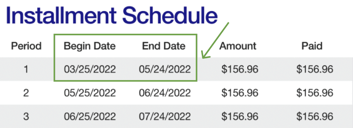
There are so many numbers that it looks messy and unnecessarily intimidating. Dates are hard to take in.

revision 1
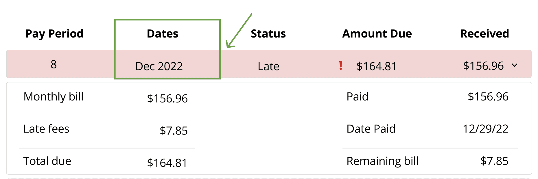
I combined the categories “Begin Date” and “End Date” into one: “Dates.” It still looks messy because the numbers don’t align vertically. Using a different format to make them align (e.g. 12/02/22 - 01/01/22) would still be difficult to read.
revision 2
When I thought about my conversations with customers, I realized that customers refer to their payments as their “December payment” or “November payment.” They don’t think about the exact dates of the pay period. I changed the number format to an alphabet format to match customer lingo.
🍕
results
I ran these high-fidelity drafts by the Head of Engineering (and really enjoyed talking with him about UX). He suggested bringing in the CEO at this time for direction.
The CEO gave the green light to keep iterating. He wanted to see more wireframes to have more options.
I wasn’t able to finish this project because I left the company.
create with me
I'd love to help.